
The 3 biggest newsletter page mistakes publishers can fix right now to get more subscribers
Over the last several years, publishers have invested heavily in newsletters. That’s great! Newsletters make great products and are effective tools for distributing content. They also are useful for acquiring more paying subscribers or donors.
Likewise, readers love newsletters as an alternative to social media recommendation engines.
A great user experience goes far in building reader loyalty. Delivering that great reader experience starts before you get the email. It’s essential you don’t let these newsletter page mistakes sabotage your newsletter growth.
Three big newsletter page mistakes stuck out in my review of more than 219 newsletter pages.
Mistake #1: Lack of focus
It’s a lot easier for someone to do nothing than it is for them to do something.
To overcome this inertia, make it crystal clear what you want a visitor to your newsletter page to do: give your their email address and consent to email them.
Simple, right? In theory, yes. In the wide world of newsletter landing pages? It’s easier said than done.
Focus on the one primary action
The goal of a newsletter page is to get email addresses. All elements should lead readers to that action: the form and the button. It helps when the form and button are prominent and eye-catching. People aren’t going to spend 15 minutes reading everything on the page.
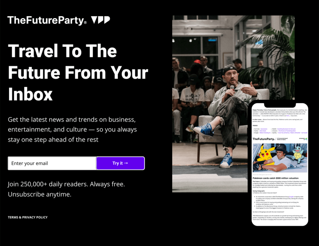
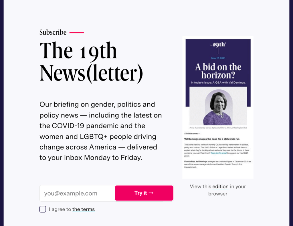
Here are three fantastic examples from the March 2023 Newsletter Signup Page Round-up:
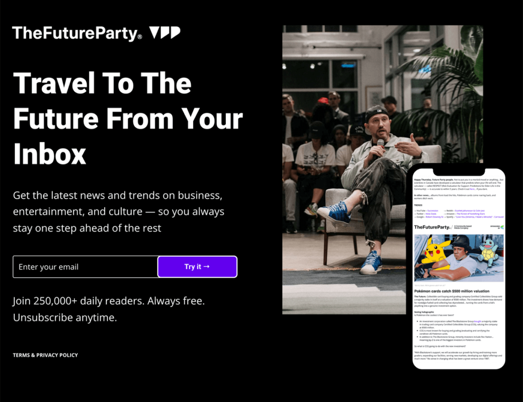
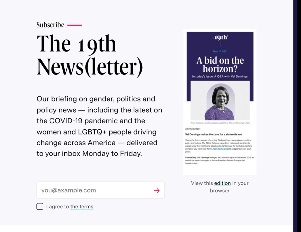
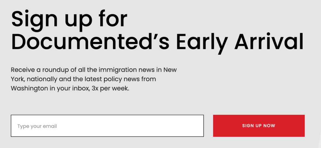
Each of them is a pretty simple layout with 2-3 prominent design elements:
- Headline
- Image
- Call to Action
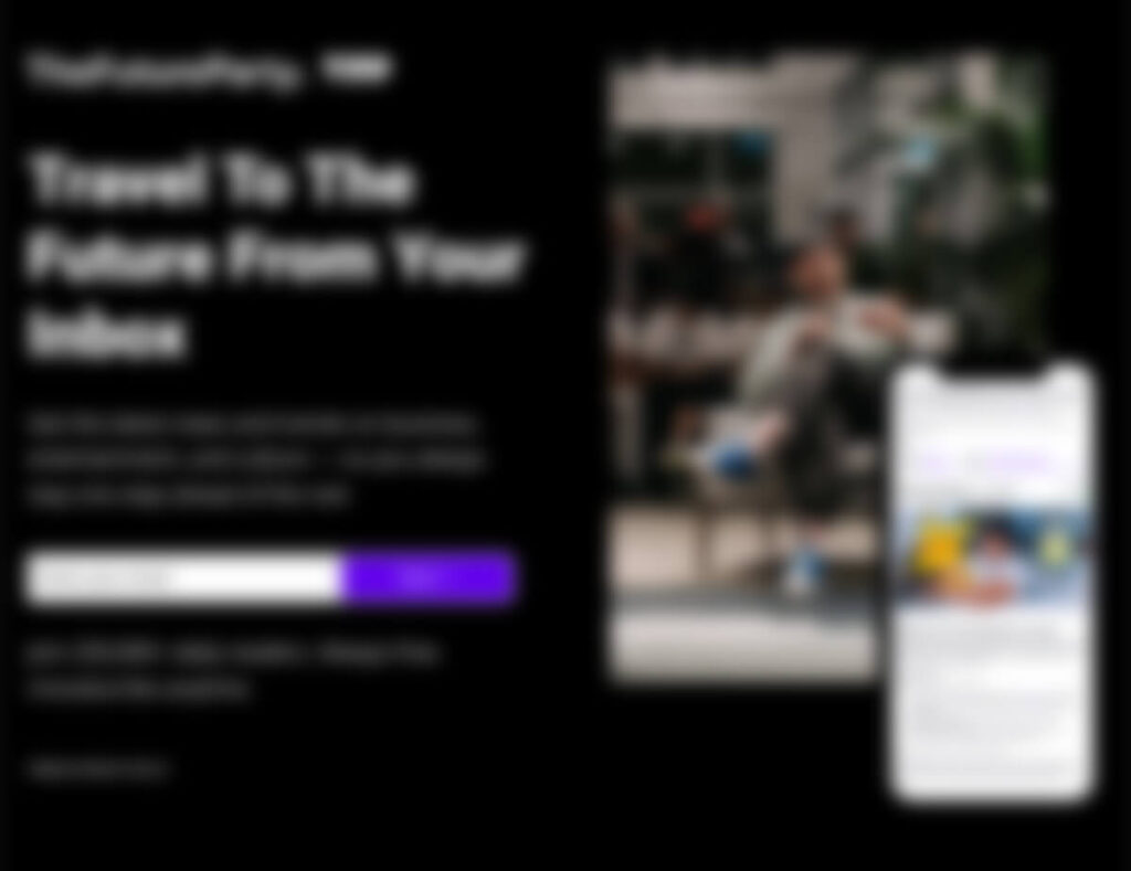
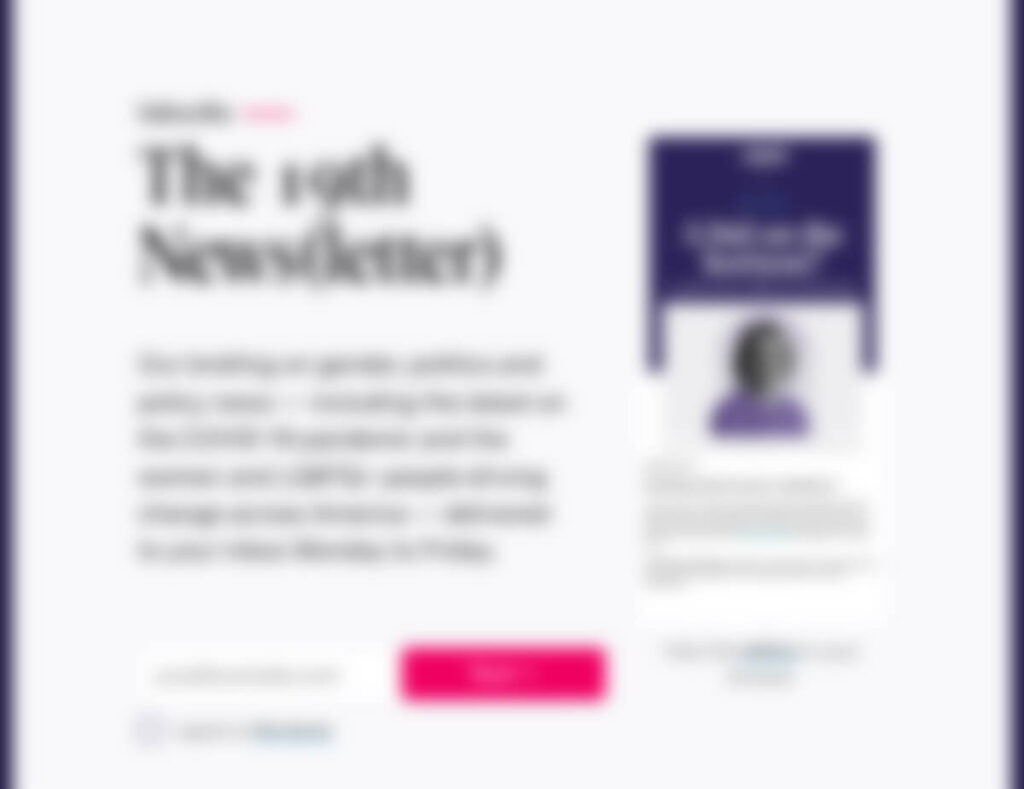
In fact, the focus on these pages is so strong they still work when they are out of focus. Check them out after I applied a 10px blur:
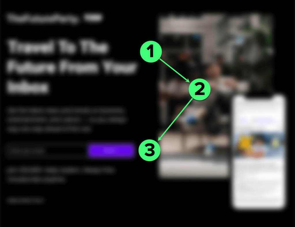
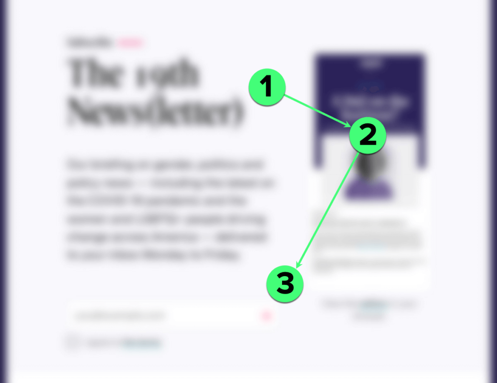
You can still see where they want you to look!
Now, compare that to the Minneapolis Star Tribune’s newsletters page when blurred:
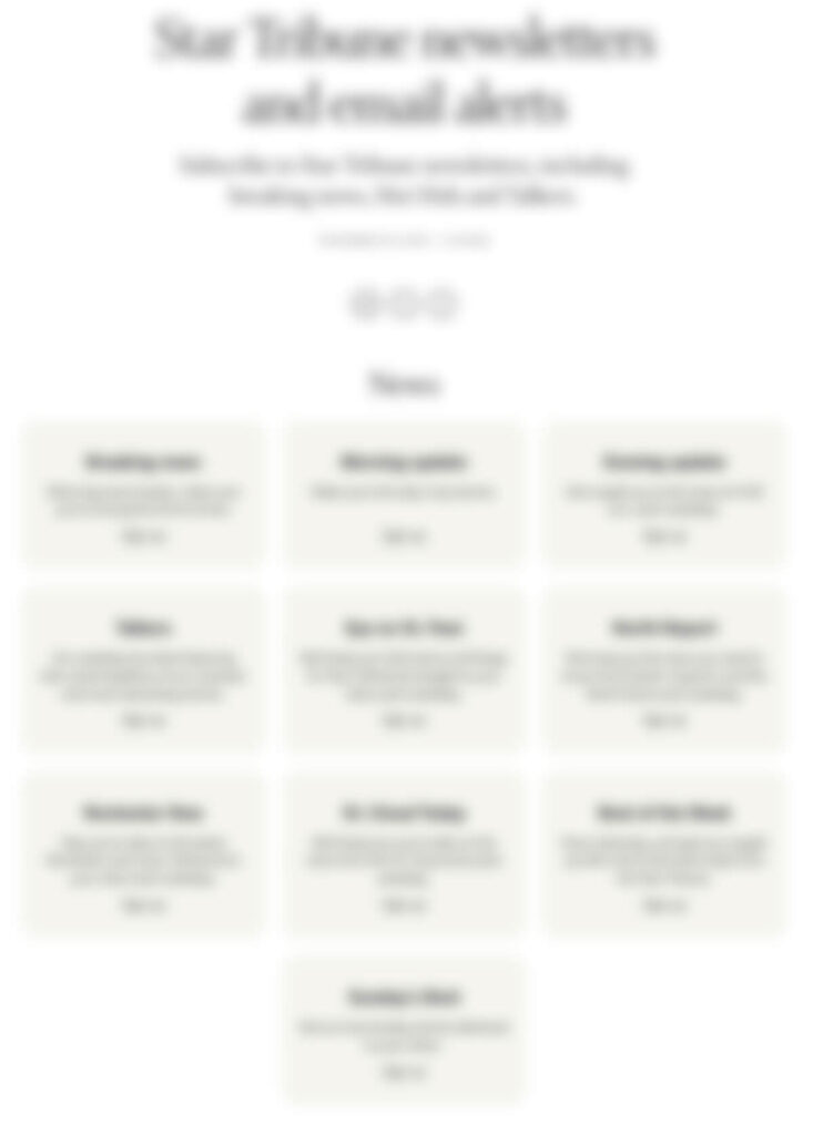
There’s no focus. There’s no flow moving the reader from the headline to a call to action. It’s a wall of beige boxes with small “Sign up” links in them. If anything, social media bugs draw as much attention as anything after the headline.
The Montgomery Advertiser and its Gannett siblings aren’t much better off:
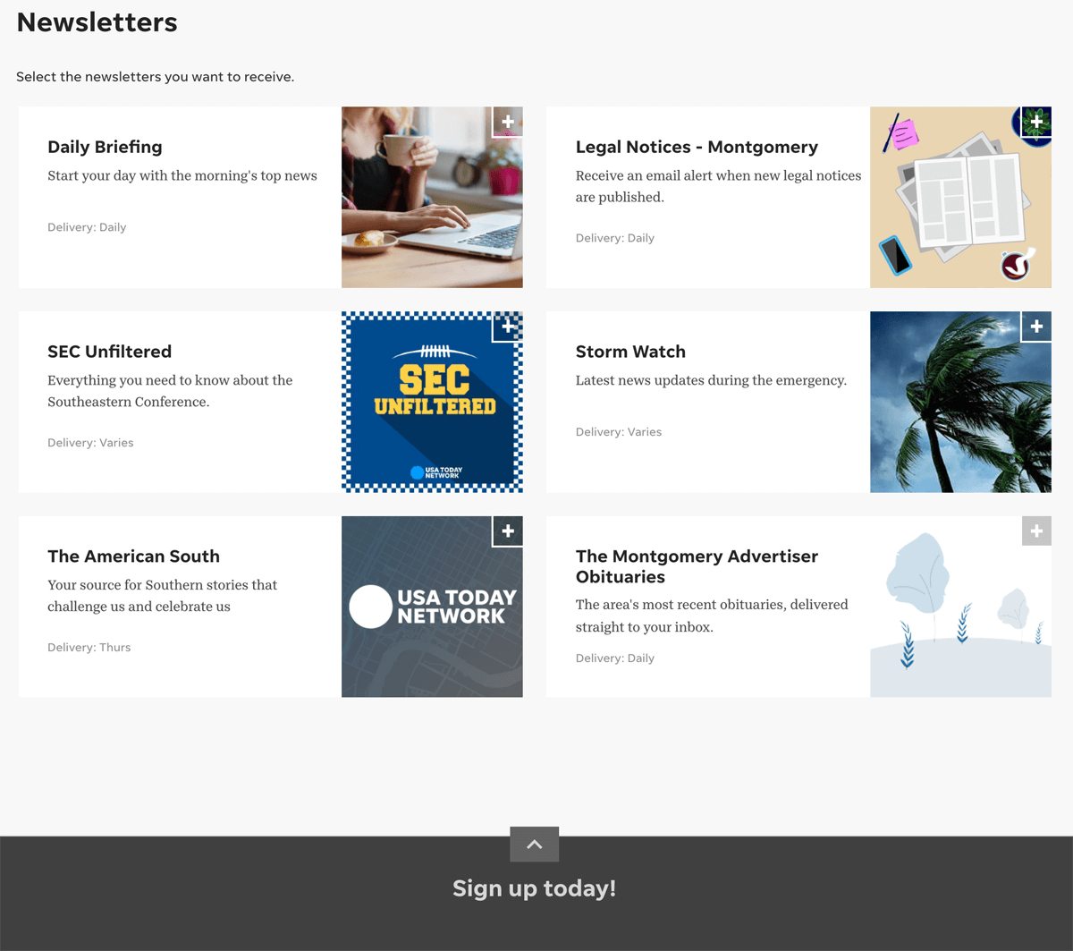
This is a good example of why I don’t like slide-up drawers for collecting emails. It feels like an afterthought at the bottom of the page. With no focus to draw you to it, it blends into the background like a footer. It doesn’t grab attention as well as other options.
How to improve the focus of your newsletter page
Here’s a quick checklist to add focus to your newsletter landing page. Remember, simple is better. If you’re stuck, you may be better off using your email provider’s form builder.
1. Make headlines big and easy to read
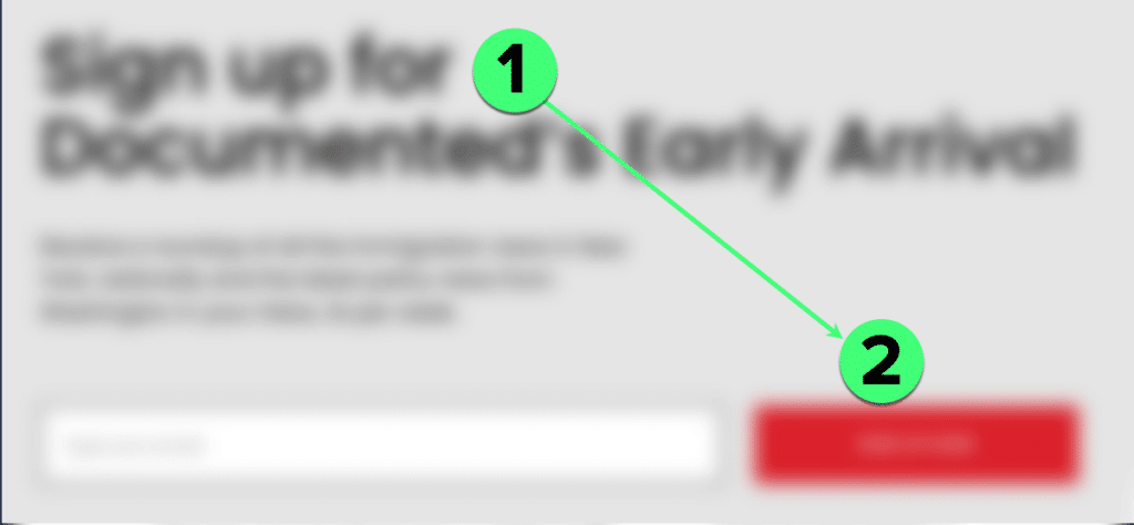
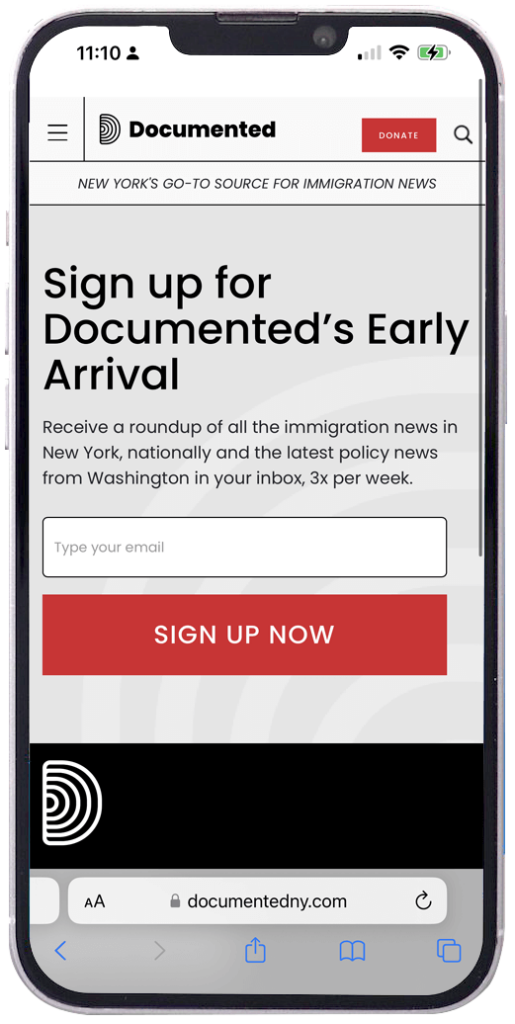
Headlines should be easy to read and not too wordy. Big and bold is nice, but The 19th* News and Documented look without bold type.
2. Use Contrast to make your form and your button stand out
In the design for non-designers post, I wrote about the importance of contrast. This is one place where I think Future Party and 19th* News could be even better. For Future Party, I’d make the form white to pop off that black background. And I’d love to see the 19th* News swap that magenta arrow for a larger button.
3. Images are fine but avoid tired stock photos
Stock image libraries are full of clichés. You work too hard for people to think your newsletter leans on clichés! Take the time to find images that connect your publication with the readers you hope to reach and your community. Even better: Hire a local photographer to get great shots.
Stock images to avoid: Coffee mugs or cups. Police lights and crime scene tape. Alarm clocks. A Photoshopped image of someone holding your newspaper — get a real photo!
It’s fine to go without images, too. The Documented example above is perfect and to the point. You can use an image of your newsletter, too. The key thing is that you don’t clutter the page and obscure the focus: getting that email address.
Mistake #2: Too many distractions and interruptions
Turn off the pop-ups on your signup pages! Please!
It’s a terrible user experience. It’s annoying. And it should be easy to fix. If it’s not easy to fix, start looking for new pop-up software.
And if you are thinking, “But we get more conversions from our pop-up!”
Okay. Then why not make your newsletter page better? It’s valuable real estate to test more powerful messaging or different tactics.
Those pop-up conversions on the newsletter page aren’t good metrics. Visitors get two different options for the same (or similar) thing on the same page. Those aren’t numbers you can glean insights from.
This goes for newsletter signup pop-ups and subscription pop-ups. These are two spots on your buyer journey that aren’t close to each other, so there’s no reason to push both on the same page.
Other distractions that steal attention from newsletter signups
- Notifications opt-in that drops down from the top of the screen
- Install Our App banners
- Sidebars
- Temporary promotions or surveys
- Turn Off Your Adblocker prompts
Remember, we want this page to have one primary action. These add things that distract readers from sharing their email addresses. They aren’t relevant in this context. This puts you in competition with yourself.
Here’s an example from El Paso Matters:

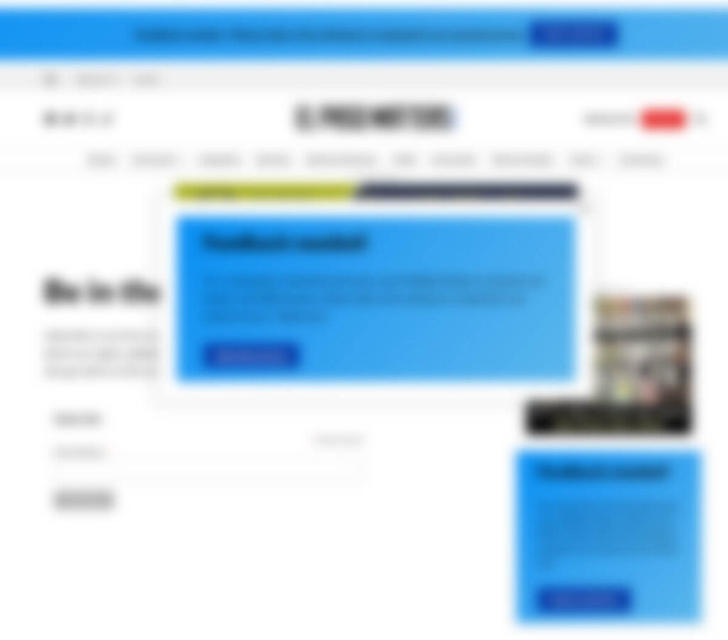
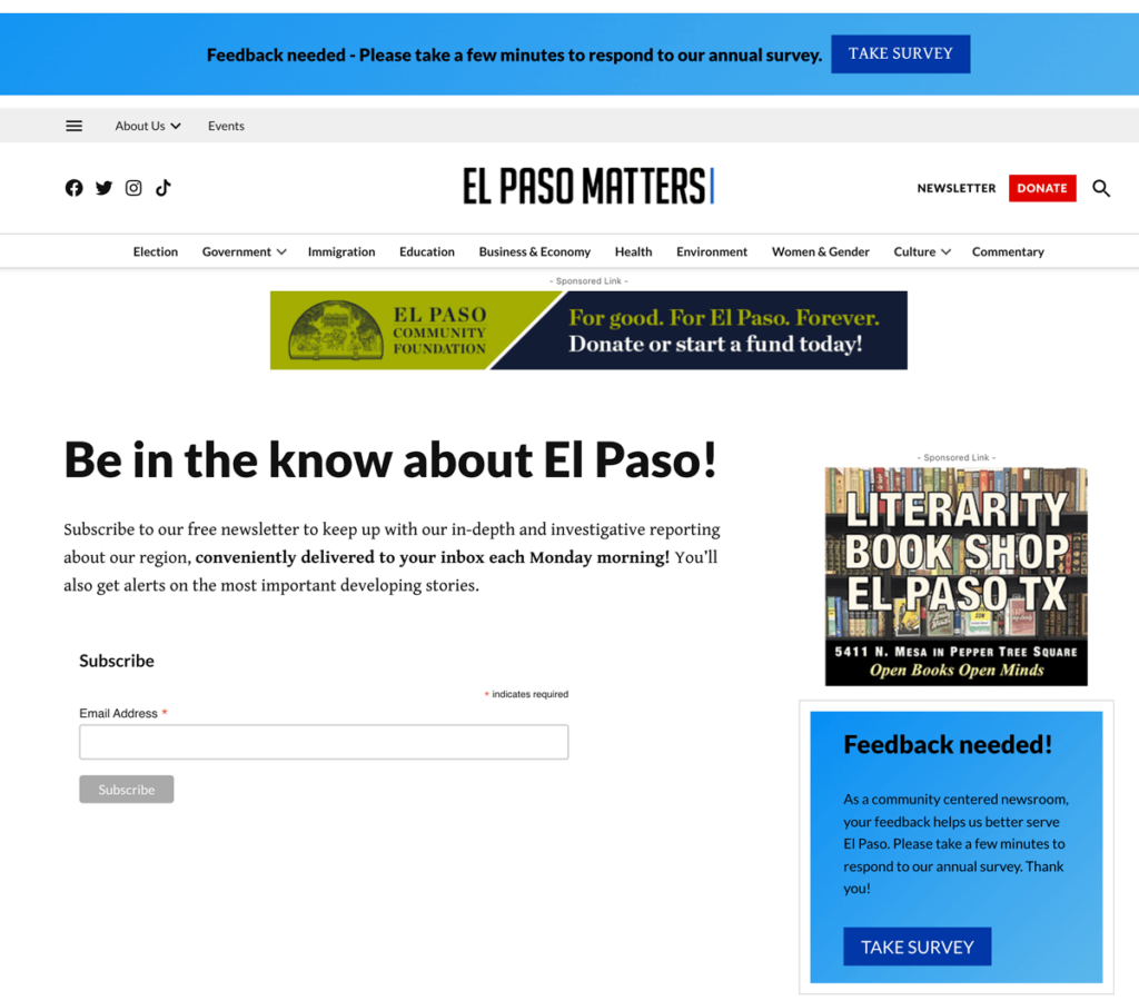
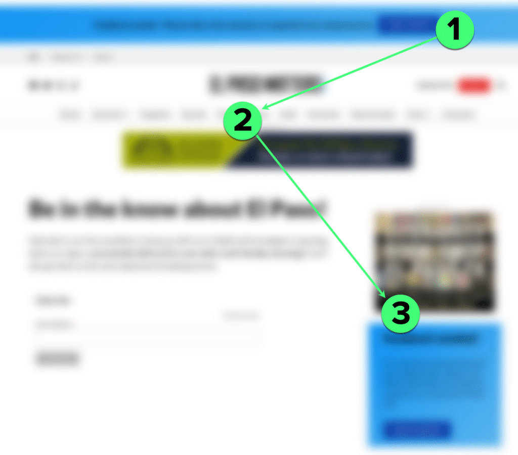
I included a blurred version, but it isn’t necessary. That blue pop-up box seizes the reader’s attention. Even after the reader closes the box, the top banner and sidebar blue box draw attention away from the form.
Here’s the important question: Do you want people to sign up for a newsletter or do you want them to fill out the survey? Because this page is asking for survey responses, not email opt-ins.
In-house promotions are important, but they don’t need to be on every page.
Subscription or Donation buttons can be distractions, too
Distractions also show up in places that are easy to forget about. Aggressive marketers recommend removing page navigation, but I don’t think that’s a good idea for publishers. Leaving people stuck on a page without navigation won’t help you build trust.
Header areas and sidebars are common places to find Subscribe or Donate buttons. These don’t belong on your newsletter page. A good Subscribe or Donate button steals attention from the newsletter opt-in.
You don’t want that. Make the decision on which is more important for the page. Once you get their email address, you can ask for a subscription or donation later.
Mistake #3: Neglecting the mobile experience
If your newsletter landing page struggles with focus and distractions on a desktop, it will feel 10x worse on a mobile screen.
If your pop-up is hard to close with a tap, you will lose that person. They won’t signup. And they will leave unhappy.
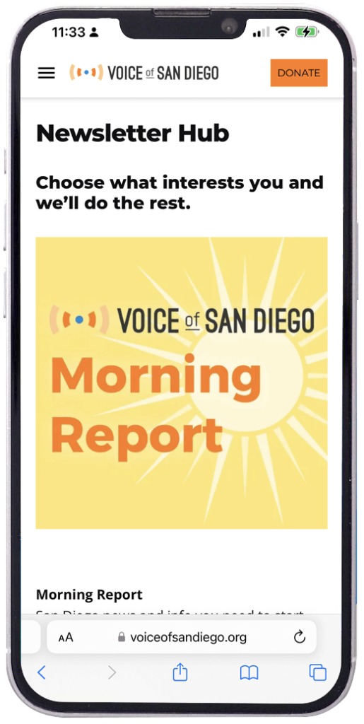
Keep the focus high so readers don’t have to scroll
Our original three landing pages all look great on mobile. The 19th* News and Future Party remove the lead image. This keeps the headline and form – the page’s goal – high on the screen.
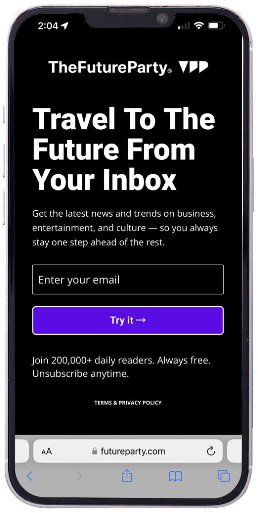
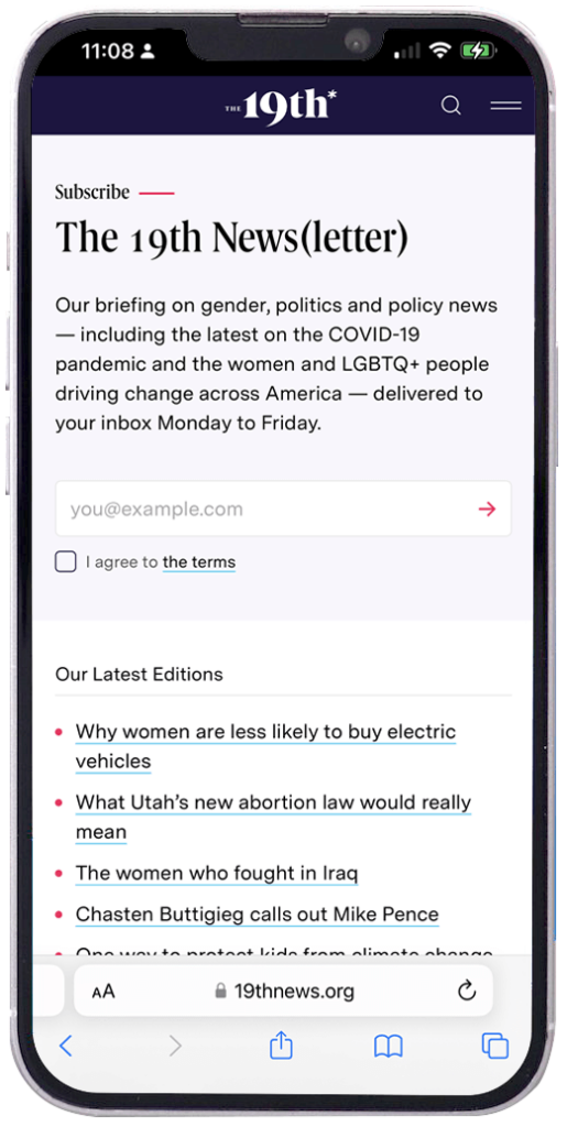
Notice how on each of these, the form is nice and high, so the reader doesn’t have to scroll to find it. The action here is simple and clear.
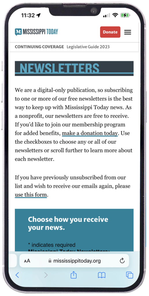
Cramming too much stuff at the top of the mobile screen is the most common mistake I’ve seen during this study. Motivated people will scroll down to find the form, but casual readers will lose interest pretty quickly.
In each of the pages below, it’s unclear where the page wants the reader needs to go. The form and call to action aren’t visible without scrolling.
Distractions become obstacles on mobile devices
Pop-ups on mobile screens are proportionally larger than their desktop counterparts. They are also harder to close. Unfortunately, this leads to distractions obstructing the page’s goal.
Let’s walk through a particularly frustrating experience from Anchorage Daily News:
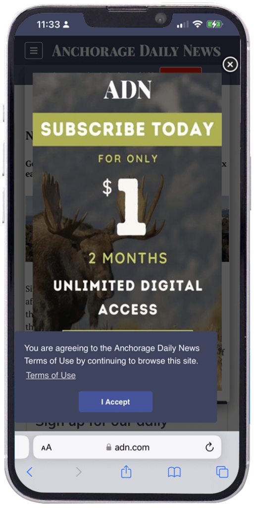
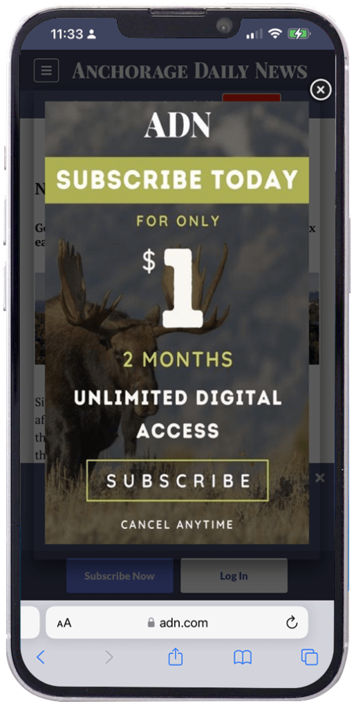
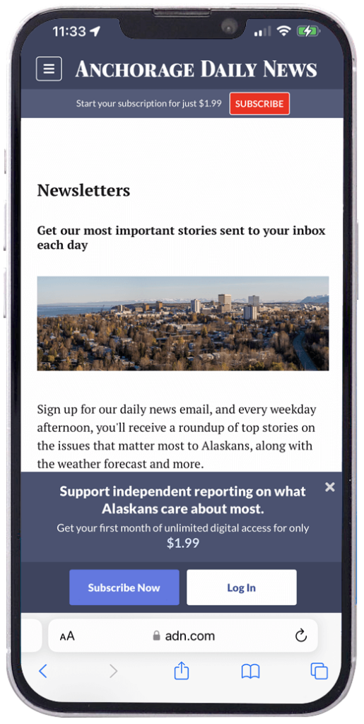
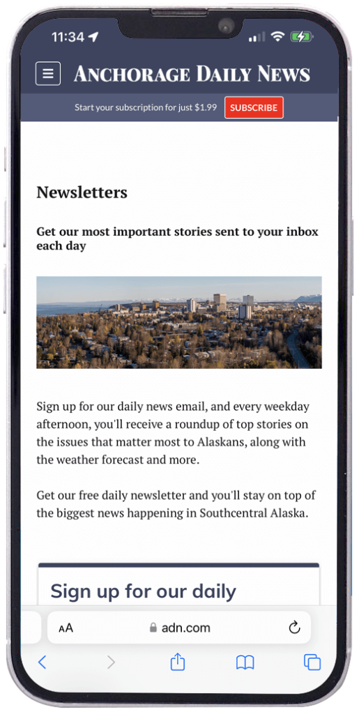
When you land here, the page bombards you with distractions. First, you have to close the cookie notice. Next, you must close the house ad with a $1 for 2 months subscription offer. Then there’s a second subscription promo that is 4x as expensive as the ad you just saw.
Finally, you can see the page you came to see…and the form is off the bottom of the screen. We can fix this by removing the photo and the copy between “Newsletters” and “Sign up for our daily newsletter.” None of this copy says anything useful, it’s taking up valuable space. These changes would make the page great, but it would perform better.
Aim for simple on mobile
There’s an old design adage attributed to French author Antoine de St. Exupéry that says, “Perfection is achieved when there is nothing left to take away.”
Space limits what fits on a phone screen. What can you remove that stands in the way of a reader sharing their email address? If it’s an essential element of the page, can you move it below the form?
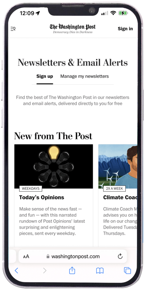
Here are some simple, effective mobile landing pages:
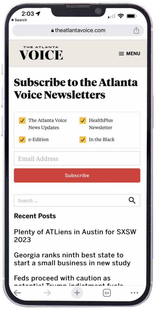
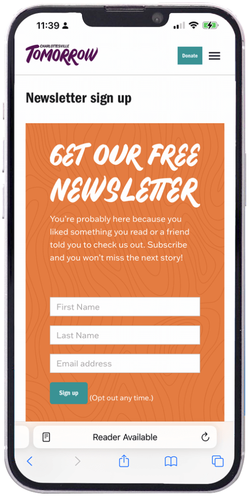
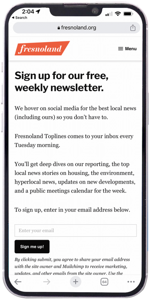
These are all pretty good! They focus on the goal of getting the newsletter signup, and they don’t bog everything down with distractions. The Atlanta Voice adds some recent stories, but they are below the call to action, out of the way. Fresnoland has more copy, but it all fits on the screen (be sure to check smaller screens, though).
Mobile-friendly newsletter pages must be fast
Last but not least, mobile page speed is crucial for your newsletter page. If your page is so slow that it features a custom doohickey that spins while it loads, it’s too damn slow.
Again, when in doubt, simplify. If you don’t have the resources to untangle why the page is so slow, there’s no harm in using the Mailchimp form. It’s not fancy, but it is quick, and it works.


 38")
