Newsletter design tips for journalists and non-designers
Jared Spool says, “Design is the rendering of intent.” In other words, design isn’t decoration. It’s how something works, how it solves problems, how it encourages behaviors — both good and bad. This is especially true for newsletter design.
Spool goes on to say, “Anyone who influences what the design becomes is the designer.” You don’t have to know CSS, HTML or what a JPG is to be a designer.
If you’re building a newsletter to get people to share their stories on a topic you’re covering, then you’re a designer.
If you work on the business side and need a button to get people to hand over some money to keep the lights on — you’re a designer.
Things work the way they are designed. If your newsletter isn’t getting the results and behaviors you want, you need to change the design.
You don’t need a favorite font to be a designer
For this post, “designers” are pretty much whom you expect: the people doing the visual work. Layouts, coding, wireframes, building templates, etc. Most have “designer” in their title. Non-designers are everyone else.
But that doesn’t change this fact: We are all designers. Especially those without “designer” in our title or who have no idea what Dribbble is.
A little secret about me: I’m a retired designer. I was a graphic designer for 15 years, but these days I only do personal side projects. I’ve hired, managed, and mentored designers. A good designer is a tremendous asset. A great designer focused on outcomes and communication is a game changer.
Better communication leads to better newsletter design
Underperforming newsletter designs are often the result of miscommunication. Designers and non-designers speak different languages, making it hard to create shared understanding.
This leads to both sides being unhappy and unsatisfied. The designer feels like everyone else’s fingerprints are ruining their grand vision, and non-designers feel like they can’t get help to meet their goals.
I want to bridge that communication gap so that we can do better work together.
This guide is for non-designers. Design often goes off the rails when people get tangled up in their own tastes and preferences. This absolutely applies to designers, too.
When this happens, designers get frustrated and defensive. Feedback takes one of two forms:
- The design isn’t resonating with the non-designer, but they can’t explain why in a way the designer can act on it. (“I know when I see it” or “Can we make it look warmer?”)
- Non-designers suggest changing little things they feel they understand enough to control. (“Can we change all the buttons to red and center all the headlines?” and the dreaded “Can you make the logo bigger?”)
What the designer often feels is the work and energy that went into the design aren’t respected. There’s a ton of work and research that goes into simple layouts. Newsletter design is a collection of trade-offs and decisions. A good designer thinks about how they all work together.
But — the designer isn’t always right. The design may not be resonating because it needs work. I want to give you a quick design course, so you can communicate effectively with designers.
Focus newsletter design goals on outcomes
Rather than think about an overall design as “good” or “bad”, try to think more in terms of your goals. When you sit down to kick off a newsletter redesign (or any project), start by defining what you want to happen as a result.
Do you want to increase clicks through to stories on your site? What about donations or subscribers? Knowing what you want from your efforts and defining them upfront will save you many headaches later.
Focusing on outcomes won’t make design conflicts magically disappear. However, if the team agrees on a set of objectives at the start of the project, your discussions will be more productive than those who have better taste.
Four principles to boost your non-designer design chops
When I was a rookie designer in the advertising department at a newspaper, one of the veteran designers left her copy of The Non-Designer’s Design Book by Robin Williams on my chair.
I gobbled it right up.
Robin breaks down design fundamentals using the acronym C.R.A.P.
- Contrast
- Repetition
- Alignment
- Proximity
C.R.A.P. immediately improved my designs, but the bigger value is how it changed my perspective. Now I could look at designs by more accomplished designers — and see the strategy behind them.
My eye for design evolved from “This is why this looks good” to “This drives you to take action because…” overnight.
Let’s see C.R.A.P. in action! (I’m not sorry.)
Contrast
Contrast creates a distinction between different parts of a newsletter design. Without contrast, it’s hard to pick up on cues to navigate web pages, our phones, and even a physical newspaper.
I like to think of contrast as guideposts or visual anchors that lead someone through the newsletter.
Size contrast
Headlines are bigger than bylines, right? That’s an easy example of size contrast. When evaluating a newsletter design, I often look at size contrast first. Are the most important elements the most prominent?
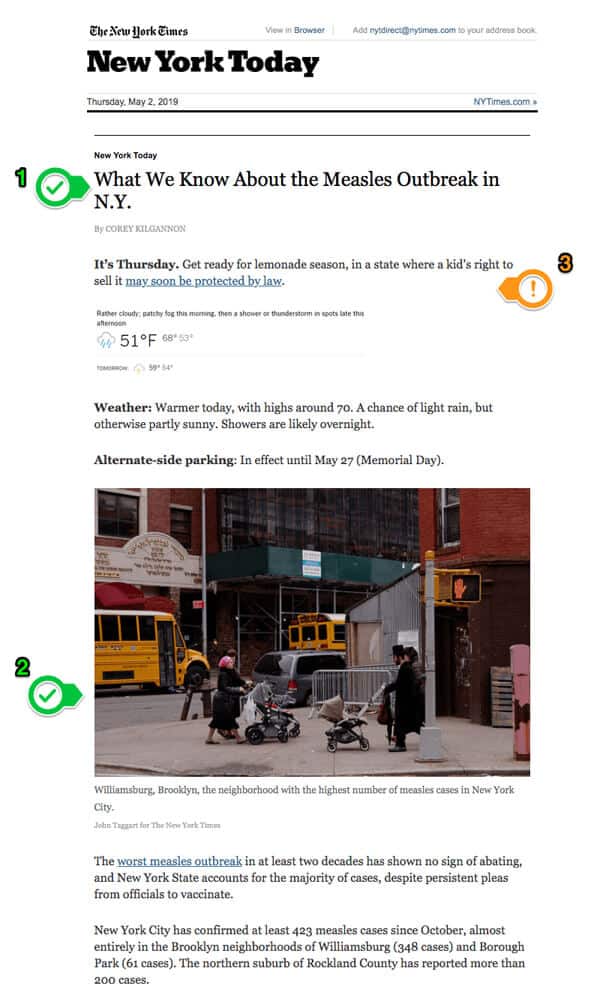
The (1) headline, “What We Know About the Measles Outbreak in N.Y.,” is the most prominent object after the header of the email. Not surprising. The next most prominent object as you scroll is the (2) photo, which leads you to the primary story.
The blurb (3) under the headline, “It’s Thursday. Get ready for lemonade season, in a state where a kid’s right to sell it may soon be protected by law,” is out of place to me. Even though it’s out of place, the tiny weather type contrasts with the headline and photo. The weather is less important than the story.
Typestyle contrast
Let’s look at another section of that same New York Times newsletter.
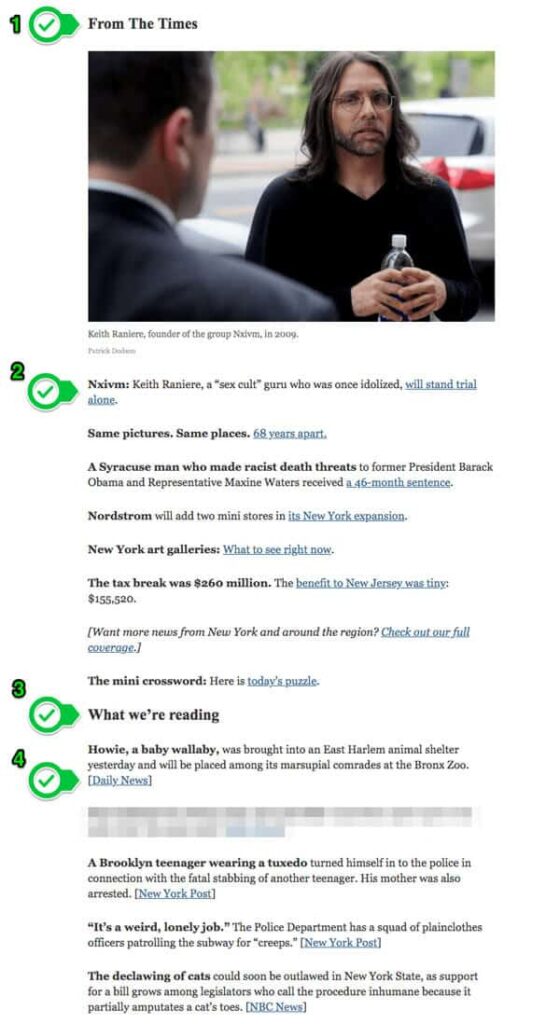
Text of the screenshot above. Highlighted areas are noted. Links have been removed.
[Highlight 1]: From The Times
[Highlight 2]: Nxivm: Keith Raniere, a “sex cult” guru who was once idolized, [linked text follows] will stand trial alone.
Same pictures. Same places. 68 years apart.
A Syracuse man who made racist death threats to former President Barack Obama and Representative Maxine Waters received a 46-month sentence.
Nordstrom will add two mini stores in its New York expansion.
New York art galleries: What to see right now.
The tax break was $260 million. The benefit to New Jersey was tiny: $155,520.
[Want more news from New York and around the region? Check out our full coverage.]
The mini crossword: Here is today’s puzzle.
[Highlight 3]: What we’re reading
Howie, a baby wallaby, was brought into an East Harlem animal shelter yesterday and will be placed among its marsupial comrades at the Bronx Zoo. [Daily News]
The husband of a Bronx day care provider repeatedly raped a girl in his wife’s care, the police said. [Daily News]
A Brooklyn teenager wearing a tuxedo turned himself in to the police in connection with the fatal stabbing of another teenager. His mother was also arrested. [New York Post]
“It’s a weird, lonely job.” The Police Department has a squad of plainclothes officers patrolling the subway for “creeps.” [New York Post]
The declawing of cats could soon be outlawed in New York State, as support for a bill grows among legislators who call the procedure inhumane because it partially amputates a cat’s toes. [NBC News]
We have size contrast for the section heads From The Times (1) and What we’re reading (3).
Each entry in those sections also kicks off each entry with bold type. This makes this section skimmable. If you live in NYC and wish there were a Nordstrom, that name in bold is more likely to be of interest.
Each section also clearly identifies the links: blue and underlined, like people expect on the web.
However, here’s a neat little detail. Check out the links in each section. What’s different?
Right! Links to The Times are (2) styled text within the sentence. Links outside The Times are in (4) brackets at the end of each section, like [Daily News]. It’s a subtle difference, but it does two things:
- It signals to the reader the story is from another source.
- It tells the reader where you are sending them.
This quick bit gives the reader information to help them decide to click or not. For example, if I don’t like reading crime stories in the New York Post, I can skip over it.
Color Contrast
Color contrast is a key part of making newsletter design accessible to all users, including those with low vision or color blindness.
But working with color is tricky. It can get subjective quickly, which leads to hurt feelings about personal preferences. There’s also color theory and brand standards and way too many things to bog a discussion down.
Here’s my advice to avoid those terrible meetings:
- When applying brand colors to your newsletter design, think of it as picking what to wear. Pick colors that go with each other, rather than trying to exactly match your website.
- Prioritize outcomes, not design inputs. When you evaluate based on desired outcomes, decisions flow toward what is working versus what someone likes.
Repetition
Repetition is when you design things based on what your users expect. What do they expect? Jakob Nielsen, usability consultant and human-computer interaction expert, puts it this way:
“Users spend most of their time on other sites. This means that users prefer your site to work the same way as all the other sites they already know. Design for patterns for which users are accustomed.”
— Jakob Nielsen
Make links look like links. Use buttons that look like buttons. Don’t get fancy and creative trying to recreate the wheel. It will confuse people, and they won’t do what you need them to do.
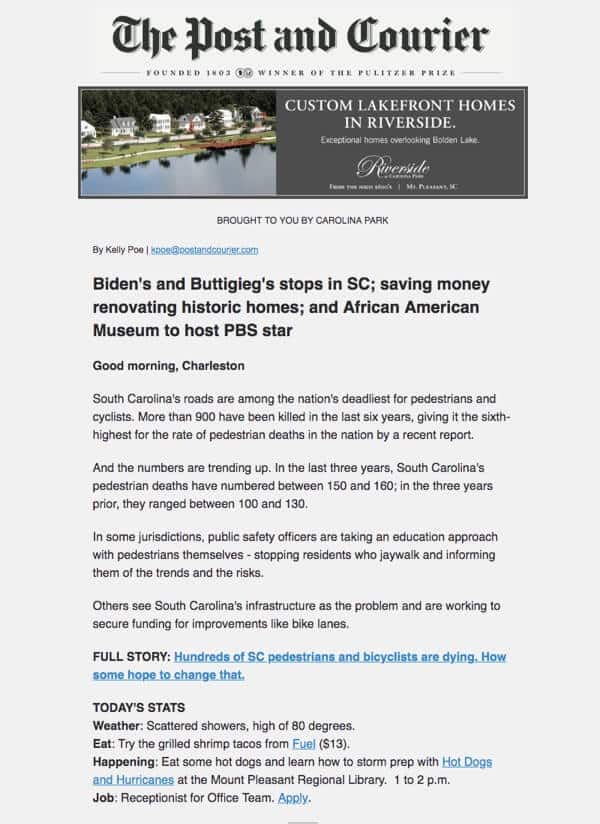
Here’s the Charleston, South Carolina Post and Courier. It’s clear what text links, and what doesn’t because links look like links we’ve seen for the last 20 years.
On the other hand, below is a section of a newsletter that needs work from ecoRI, covering environmental news for southern New England. How many links do you see?
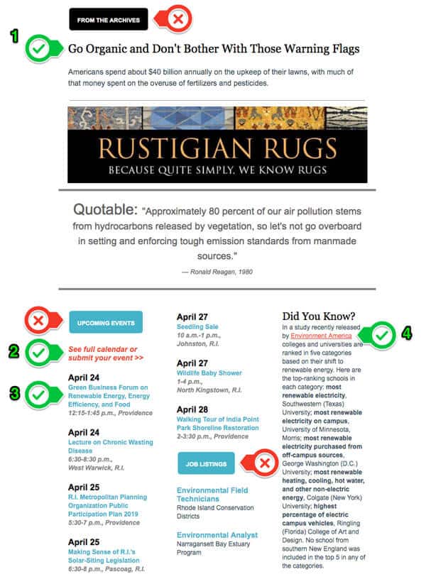
Up top, we have (1) a nice big clickable headline. That’s good.
Next, we have the (2) full calendar link and (4) Environment America link. It’s not the end of the world, but better repetition would underline the calendar link and remove italics. But there’s a bigger problem.
I cropped the email, so you can’t see that most non-headline links in the email are red.
When do you most frequently see red text on a screen? When something is wrong, like an error message. I’d advise ecoRI to avoid red for links because people associate red with errors and other negative feedback.
In the calendar section, we have the (3) event titles linked in blue. These aren’t obvious as links, because most of the links are red and underlined.
Here’s where it gets more confusing. There are two buttons that are the same color blue. People expect to click on buttons. But these blue buttons go nowhere. They aren’t links.
I’ll bet you lunch ecoRI would get more clicks if they:
- Changed links throughout to match the blue event titles.
- Made the buttons regular text like the Did You Know on the right.
Up at the very top, we have another button. It’s black: From the Archives. That sounds interesting. What else is in the archives? I have no idea. It’s a button without a link.
People expect buttons to be links. If you don’t meet those expectations, you are training them not to click on your emails.
When working with repetition or consistency, make sure your newsletter design is consistent with what users expect, not your other designs.
Alignment
Alignment keeps things ordered in the design. Most newsletters are single-column layouts, so a large majority of the 99 Newsletters do a good job with alignment.
A few struggle because they don’t use a single-column layout. More than one column in a newsletter design is tough to execute well. Richland Source from Ohio has alignment problems.
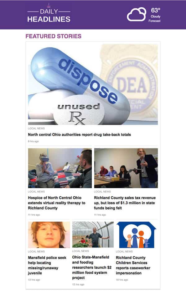
The way the top stories go from one column to two columns to three columns is cluttered and harder to follow than a single-column layout. Unfortunately, it continues down the page.
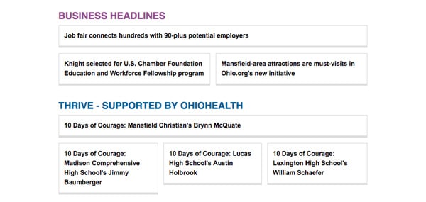
There are times when boxes make things more prominent. However, these boxes all look the same. No contrast makes it hard to distinguish what is most important.
Furthermore, the boxes have the same problem as the top stories. The first section is one column moving into two columns. The next section is one column transitioning to three columns.
These boxes make it harder for a reader to get information. Readers would benefit more from a list of text links, like the New York Times example above.
Proximity
The proximity rule says that similar things should group together.
The 99 Newsletters do a pretty good job of grouping things together. Top stories, recommended links, and event listings. There were lots of good examples of section breaks.
Proximity also means there should be space between unalike objects. Without space to breathe, newsletter designs get cluttered and frustrating. This is even worse on mobile. If the links and buttons are jumbled, it’s easy to tap the wrong spot.
Here are two examples of how a little space can make a world of difference.
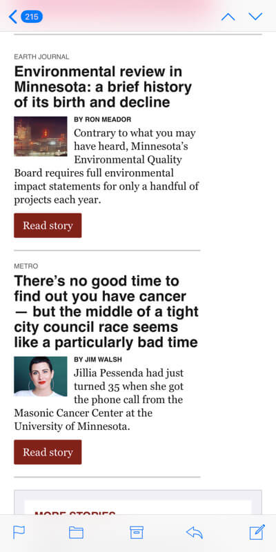
The MinnPost newsletter has too much stuff crammed in small spaces. The contrast between the headline and excerpt is nice, but it’s all squeezed to the left, with wasted space to the right. The tightness from the headline to the button makes it hard to read.
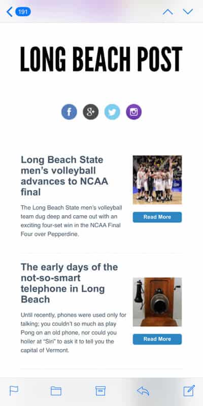
Compare this to the Long Beach Post. It has the same elements, minus a byline: Headline, excerpt, a larger photo, and a smaller read more button. But the space between elements makes it much easier to read.
All this C.R.A.P. builds a visual hierarchy
These four principles alone can turn around a lackluster newsletter design. Now that you know the C.R.A.P. method, you will start to see how contrast, repetition, alignment, and proximity work to create a visual hierarchy.
One of my favorite examples of using C.R.A.P. to create a meaningful visual hierarchy is the Philadelphia Inquirer’s Morning Headlines Newsletter. (Full, uncropped image is here if you’re curious)
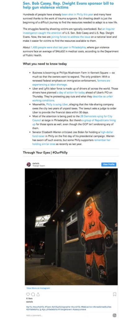
What’s pleasant is how each of the sections looks on a phone. Each one is just slightly longer than my screen. So as I scroll to see the last bit of a section, the next section is introduced. It pulls me through a newsletter with a lot of content.
Are you ready to put your newsletter design knowledge to the test?
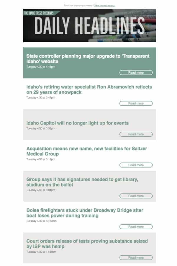
Below is a newsletter from the Idaho Press in Nampa, Idaho. What design changes would you suggest?
Some suggestions for Idaho Press, plus a surprise!
Here’s what sticks out to me more than anything: there’s no hierarchy here. Everything looks too similar. Because this design isn’t guiding me to what they think is important, I am left to figure it out. Do I have time for that? Probably not.
How we can suggest design changes constructively
We want to give our newsletter designer feedback they can use, with reasons they understand. Here are a few:
- “I think we should increase the contrast, so people can scan the headlines more easily. Can we see how it looks with black headlines on a white background?”
- “The Read More buttons are a good idea. Can we fill the button with one color so they are more consistent? We should test to see if that encourages more people to click them” (Protip: Designers tend to think consistency rather than repetition. Unfortunately, CCAP is not a good acronym.)
- “The green box isn’t getting the attention we expected for the top story. Can we increase the contrast by making the headline more prominent?
- “We should also experiment with adding a photo to contrast the top story with the other stories”
- “Can we see a version with the Read More buttons on the left? I’d like to see if aligning them with the headlines increase click rates.”
Here’s your surprise!
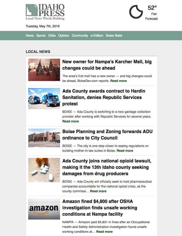
I’ve seen some minor changes to newsletters over the past few months, but Idaho Press started sending this one recently. It looks much better, and I hope they keep experimenting to find those big newsletter design ideas. Did they incorporate any of your suggestions?
Bonus: 5 actionable newsletter design tips for journalists
Lots of non-designers end up taking on design duties with newsletters. It’s hard. You have your job and your responsibilities, and then piled on top are tasks that you are good at, but probably didn’t get the training you wanted.
That happens a lot.
Sometimes that means newsletters have issues that can be easily fixed, but the person who is producing it may not have the training they deserved. Below are 5 tips – 6 if you count the bonus tip – that is easy to implement and will make your newsletter more reader-friendly.
Include a “View in Browser” link
Give people the option to read your email in a browser. There are enough readers with different needs and preferences that it’s helpful. Even if you love your layout.
48 of the 99 Newsletters do not include a View in Browser link.
Some readers open emails in browsers to make them larger and easier to read. Others may have images turned off in their inbox, but want to see the images without fussing with settings.
Every so often I run across wonderfully designed emails that I want to save and read later. I know it will get lost in the black hole of my inbox, so I open it in a tab to revisit when I have time. No view in browser link makes that harder and generally means I forget about it.
The view in browser link also makes emails easier to share on social (or dig into as part of a 99 Newsletter Project).
Make your body text bigger
Open your newsletter on your phone. Extend your arm with your phone in your hand. Now close one eye.
Can you read the body copy without straining?
To check the 99 Newsletters, I took off my glasses and performed this test. I can easily read a printed letter or Twitter with one eye at arm’s length.
12 of the 99 Newsletters had text that was definitely too small.
24 of the 99 Newsletters had text that was borderline too small for my nearsighted eyes. Nudging up one step would fix these.
Keep in mind that serif fonts like Times are harder to read at small sizes than sans serif fonts like Arial. Also, don’t rely on the pixel size. Take the time to look at it, and have other people look at it too.
If you have larger blocks of text, you may need to increase the line spacing as you increase the type size. The only way to know is to test, evaluate and re-test.
Use large, compelling images
The bigger your images are, the better. Especially on mobile. Full-width photos are easy to see, easy to skim and help break up your content. They are also easier to click (more on that in a second).
40 of the 99 Newsletters had images that should be larger.
Bigger is better, but images also need to be compelling. Zoning meetings are important, but they aren’t sexy. Do you know what’s less sexy? A photo of a zoning meeting.
If photos don’t say “hell yes”, then leave them out. Photos are more work for you and slow down your newsletter (and gobble up data) if they are too big. Try a map or illustration or a great file photo. Otherwise, let your words sell the story.
This is crucial if you are using small images on mobile. On a phone, I’ve seen newsletter images that are the same size as my thumbnail. That’s smaller than a postage stamp!
Lastly, never use stock photos. It looks cheap and everyone knows they are stock photos.
Link your newsletter images
In addition to using larger images, make them clickable. If you are using compelling images, people will be drawn to them. Don’t make readers hunt for the text to click. Make it easy. Let them click the image.
32 of the 99 Newsletters did not link their images.
I’d also look at linking your logo. 68 of the 99 Newsletters have a clickable logo. Most of those go to the home page, but a few link to the browser version of the email or a specific section.
Bonus Tip: Link your newsletter headlines, too
Tapping on a link on a phone can be hard. Make it super easy. Create a useful link package for each story. Headline, photo, and “read more” link all go to the story on the website.
Think smaller: Gmail clips newsletters over 102 kB
Gmail limits emails to 102 kB. If you go over this limit, it clips off the bottom of your email and adds this message.
Gmail users aren’t getting your whole newsletter. That’s probably at least 30% of your subscribers. It may be 50% or more
But it’s worse than that.
Your newsletter tracking is at the bottom of your email. It gets cut off too. If this subscriber doesn’t click the “View entire message” link — you aren’t getting data from this email.
How many do you think are clicking to open the full message in another window? Not many.
Tips for fixing clipped newsletters in Gmail
The 102 kB applies to the HTML of your email, not images. Would you believe 19 of the 99 Newsletters send out clipped emails? One was 179 kB. Not even close. It sucks seeing a small publisher shoot themselves in the foot.
Here are three ways to avoid Gmail clipping:
- Simplify and streamline. Rather than spelling everything out, use links. Drop any unnecessary images. The code putting images in place takes more code than text. If you have a multi-column layout, move to a one-column layout. It’s easier to read, and it saves you some code.
- Don’t paste text from Docs or Word. Word processors add formatting that will chew up your 102 kB, even though you don’t see it. If you use Mailchimp, use the “Paste Rich Text” feature. If you don’t, paste your text from a plain text editor like Notepad.
- Preview, preview, preview. If you don’t have a tool like Litmus, send yourself test emails to make sure your message isn’t getting clipped.
Little things add up
When you make it easy for users, they are going to trust you more. They are going to trust your reporting and your work. It all adds up, so grab that low-hanging fruit.
