Newsletter unsubscribe examples that will help you maintain relationships with your best readers
Watching people unsubscribe from your newsletter sucks. In this post, I will share some newsletter unsubscribe examples that will make it easier for you to retain the readers you need to be successful, without dragging down the whole list.
I’ve been analyzing the design of the 99 newsletters, and I needed to unsubscribe from one. Someone had added me to a new newsletter that I never signed up for (please don’t do that).
When I struggled to unsubscribe, I saw newsletters pulling out all the stops to keep me from leaving. This will backfire big time.
This industry is tough enough as it is. Let’s not sabotage ourselves.
Make good choices that benefit users
Obscuring your unsubscribe link is a choice.
When you choose to hide your unsubscribe link:
- You are begging to get marked as spam.
- You damage your deliverability.
- You harm your standing with your readers.
None of those are worth it! But there’s more: hiding your unsubscribe link makes it harder to learn what’s resonating with readers. It’s a textbook case of shooting yourself in the foot.
Your list is going to degrade over time. People churn out for reasons you can’t change: they move, they change jobs, and even when they die. Even for free newsletters, it’s helpful to measure churn to monitor these changes.
The solution isn’t to make it harder for them to leave. Instead, focus on acquiring high-quality new subscribers, and develop targeted newsletter segments to deliver the personalized value that builds loyalty. One loyal reader is worth 1,000 (or more) disengaged subscribers.
Let people unsubscribe from your newsletter
Checked-out subscribers on your list are holding you back from your newsletter goals. Let them unsubscribe. Better yet, make it easy to unsubscribe.
According to Litmus, 50% of consumers mark an email as spam because it is confusing or painful to unsubscribe.
This is important because spam complaints harm your deliverability. Unsubscribes do not. Moreover, spam complaints have a ripple effect. It doesn’t only apply to the person who marked it as spam.
When the mailbox provider starts noticing spam complaints, they start filtering your emails. The filter isn’t limited to the person who flagged it. It affects everyone. That spam filter eventually will catch all your Yahoo subscribers. Or all your Gmail subscribers. That’s way worse than the Promotions tab.
The takeaway: if you don’t want users to find the unsubscribe button, then you want to frustrate them. And you want them to mark you as spam. That’s definitely not what we want, so let’s look at easy ways to fix it.
Make it easy to unsubscribe
The first step to making it easy to unsubscribe is using that specific word: unsubscribe. That’s what your disengaged reader wants to do, so use the word.
Euphemisms and corporate jargon don’t help your readers. No one wants to “manage their preferences”.
Another thing I’ve seen is people linking to words that aren’t “unsubscribe”. There’s no need to be clever or helpful by highlighting words other than unsubscribe, like “click here” or the user’s email address. Give the people what they want.
Constant Contact uses their trademarked term “SafeUnsubscribe™”. I recommend changing it to “unsubscribe”. People aren’t looking for a word Constant Contact made up.
Put the unsubscribe link at the bottom
People look for unsubscribe links at the bottom, so put them there. If you have one at the top or in the body of the email — great! Put another one at the bottom to cover your bases.
Make the unsubscribe link stand out
Now that your newsletter says “unsubscribe” at the bottom. What’s next?
Draw attention to it:
- Increase the type size
- Make it bolder and with higher contrast.
- Underline it.
- Separate it from other elements, especially text.
You should do all four of these. At the very least, do three of them. It should be obvious it’s a link. If you make it high contrast and bold, then it’s not 100% necessary to underline it.
A solid newsletter unsubscribe: Roanoke Times
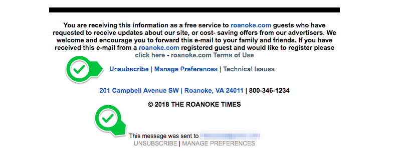
Text of the screenshot above. Highlighted areas are noted. Links have been removed.
Hey, ProPublica Illinois readers,
This is Kelly Bauer from Block Club Chicago, the city’s nonprofit neighborhood news site. We’re here to let you know we’ve been digging deep into ProPublica Illinois’ massive new database of parking tickets in Chicago (more on that below) to find stories within the city’s neighborhoods.
This week, we wrote about how the 41st Ward on the Northwest Side and the 19th on the Southwest Side get the least tickets — and they’re also the wards that are home to the most police officers and firefighters. We walked the neighborhood and talked to residents of the 41st about why ticketing is low in the area.
This story highlights the kind of reporting the Block Club team brings to you every day: We’re in the neighborhoods talking to regular people, writing about what matters to each community.
[Highlighted paragraph, because it is fantastic]: Keep a lookout for more stories as we continue using ProPublica Illinois’ database and examining how ticketing affects the neighborhoods and people of Chicago. If you want to keep following our work, sign up for our daily newsletter here and become a subscriber here. Your support means we can continue covering Chicago’s neighborhoods and writing these important stories.
Thank you for reading. I’m handing it off to David Eads, news applications developer at ProPublica Illinois, to let you know some of the ways you can use the database to learn about where you live in the city. — Kelly
This example from the Roanoke Times does the job. Unsubscribe is pulled out from the big block of text before it. It’s the first choice in the line. It’s bold and it’s blue. And just in case you scroll too fast, there’s a second UNSUBSCRIBE at the very bottom.
Make the font size bigger
My only minor quibble with the Roanoke Times example is the type is a little small. However, the combination of putting unsubscribe on its own line, making it bold, and making it blue keep it easy to spot and click.
The median font size for the unsubscribe links in the 99 Newsletters is 13 pixels. Some are as small as 9 px, which is way too small. The largest is 16.25 px, nice and large. I wouldn’t go smaller than 14 px, and 16 px is even better.
Don’t worry. Loyal readers aren’t going to be so entranced by your unsubscribe link that they click it. If this worries you, add a link on the unsubscribe page telling people how to resubscribe.
Our friends at the Arkansas Democrat-Gazette handle this nicely:
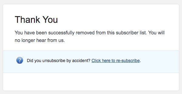
People looking to stop receiving emails will thank you for letting them unsubscribe easily (even though they aren’t going to tell you). They will thank you by not reporting you as spam. Or resubscribing later!
Mobile newsletter unsubscribe examples
A lot of unsubscribe links end up in the fine print of the footer. The fine print is already challenging on a desktop; it’s much harder to tap a tiny link with your finger.
It should be easy to tap the unsubscribe link on a phone. On mobile, it’s important to separate the unsubscribe link from other text and links in the footer.
Let’s look at some good examples you can copy:
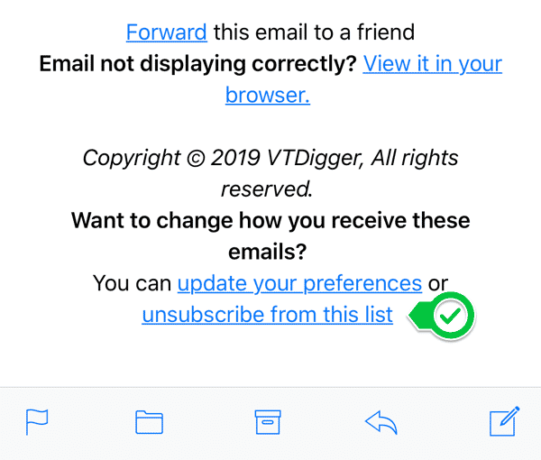
VT Digger, a nonprofit newsroom in Vermont, doesn’t reinvent the wheel. They make the font size nice and big and styled it like a link. This is nothing more than helpful styling added to standard Mailchimp verbiage. Mailchimp accounts for 52.5% of the 99 Newsletters, so I saw a lot of straight out-of-the-box footers.
People looking to stop receiving emails will thank you for letting them unsubscribe easily (even though they aren’t going to tell you). They will thank you by not reporting you as spam. Or resubscribing later!
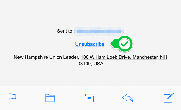
Last but certainly not least is the Weekender from inewsource.org in San Diego. This red button is easy to see and tap on a phone, even if I wish the type were a bit larger.
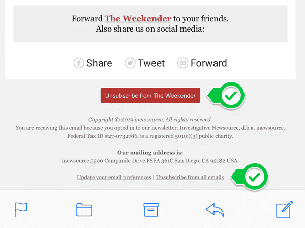
Note the second marker. There’s also a link to unsubscribe from everything. A nice touch!
Don’t annoy people with your preferences page
The best option for handling unsubscribes is the effortless one-click unsubscribe. It solves the problem with the least amount of effort for your users.
The Brief from Texas Tribune goes one step better. Like inewsource.org, they give you the link to unsubscribe to everything right there in the email.

That’s a boss move. It helps keep the Tribune list clean. It takes a lot of confidence, but you can do this, too.
But what if you have a bunch of newsletters, or your email provider doesn’t make global unsubscribing easy? In that case, you need to make the unsubscribe page as straightforward as possible.
The most user-friendly option puts “unsubscribe from all newsletters” right at the top of the page. None of the 99 newsletters do this.
If you aren’t struggling with spam complaints, and you aren’t experiencing deliverability problems, then you’re probably okay. I would keep an eye on it, especially when you get big waves of new subscribers.
Don’t force people to log in to unsubscribe.
If you don’t use an “unsubscribe from all” link like Texas Tribune, then you use the Manage Preferences page, or something similar.
This step is unnecessary. You have their email address. You are asking users to jump through hoops, and they will not be happy about it.
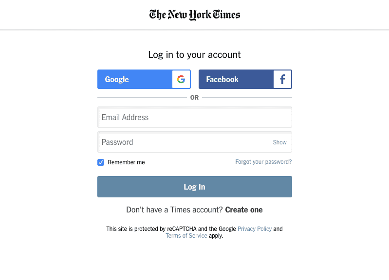
Only 1 newsletter required a login to Manage Subscriptions: The New York Times.
Slightly more common (14.8%) are unsubscribe pages that weren’t clear. For six newsletters, it isn’t clear if you unsubscribe from one newsletter or all newsletters. Five others make the “unsubscribe from all” option very hard to see.
A whopping 30.5% of publications do not offer users the option to unsubscribe from everything. That’s disappointing.
Put yourself in a reader’s shoes. You know what it feels like when you can’t figure out how to get off a mailing list. You understand how it feels like cheating when a retailer unsubscribes you from one list, but not another list you never realized you were on. Let’s not do that to people. We want them to trust us.
Arkansas Online is the website for the Arkansas Democrat-Gazette in Little Rock. Their preferences page could use some work. Let’s take a look at it.
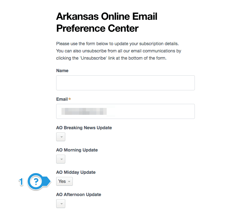
(1) I’m subscribed to the Midday Update. I can figure out that AO stands for Arkansas Online, but wouldn’t it be helpful to spell it out? You have to show readers what they need to do.
The dropdown says “Yes”. So far so good. I can change it to “No”, which presumably would unsubscribe me. But wait…
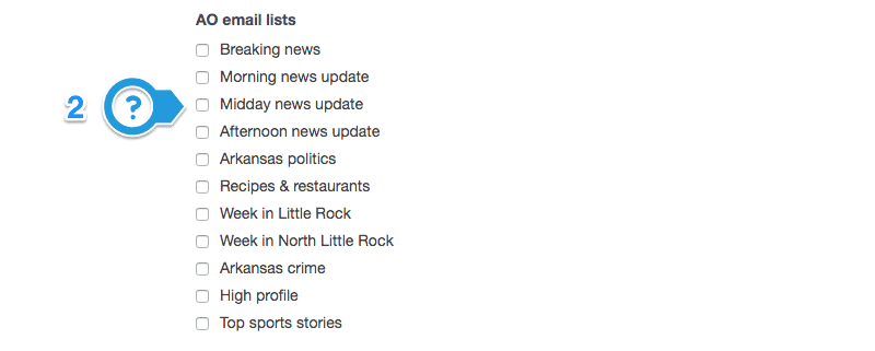
(2) What are these checkboxes for? I came here to unsubscribe. Do I check the boxes I want to unsubscribe to? Do I check the boxes for new newsletters I want to get? What happens if I put “No” above, but check the box here?
I have no idea. I’ll guarantee you users aren’t going to spend more than two seconds trying to figure it out.

To add insult to injury, (3) here’s the “unsubscribe from all” link hiding below the save changes button. This is a very long page I cropped. Then way down here, a link. In light grey that’s hard to read.
It’s important to walk through these steps before you launch, and re-visit them regularly. Time yourself doing it. I bet it takes longer than you think — and you know the right answers!
Oh — one more thing. Don’t send that “unsubscribe confirmation” email if you can help it. It’s the 64-inch CVS receipt of email newsletters.
A healthy mailing list works harder for you
If you have a list of 130,000 subscribers, but 30,000 haven’t opened any emails over the past six months — what’s the value there?
What’s the value for them? You’re sending them something every day that doesn’t get looked at, much less read.
What’s the value for you? They aren’t reading your messages, and they aren’t engaging with your content. It’s about as effective as donning your newsboy cap and yelling headlines on a quiet street corner.
What’s worse is they are dragging your numbers down. If your open rate is 19% on 130,000, scrubbing those 30,000 inactive accounts bumps you up to 24.7%.
Granted, I don’t think Open Rate is the top metric you should focus on. But I bet there’s at least one upper-level manager excited to see a 5.7% increase on the opens report.
The real value of more accurate measurements is you’ll learn more. You gather clearer insights when you don’t have data clouded by inactive subscribers.
When you have clearer insights, you can deliver more value to the people who love your newsletter.
Your newsletter is a relationship between you and a reader. Allowing them to go shows that you respect their time and attention. Making it easy gives them a reason to trust you. Doing right by your users is an investment that pays off every time.
