
Get inspired: Newsletter Signup Page Round-up (March 2023)
A publisher’s newsletter signup page benefits two different types of readers:
- It helps people who know they want to signup get there without having to do a bunch of searching for an inline form or pop-up.
- It helps people who don’t know much about your publication evaluate your newsletter and gives you the opportunity to show you are trustworthy. You can also overcome objections before the person closes the window without signing up.
Tips for getting useful insights from these newsletter signup page examples
Each landing page in this roundup is from February-March 2023. The goal here was some variety, so publishers could see what other publishers are doing on their signup pages. I’ve added comments to note what is great in some of these and how I might have approached other items differently based on my experience.
Zoom in: Each newsletter signup page can be clicked to see in higher resolution.
As always, YMMV (your mileage may vary). Please test out different variations to make sure they are serving your goals. There are no silver bullets! I have no inside knowledge of why any of these pages are set up the way they are. It’s possible a newsroom has found success with a tactic that I’ve never seen succeed.
Remember: “Best practices” should be a starting point, not a “set it and forget it” switch. This also goes for my recommendations!
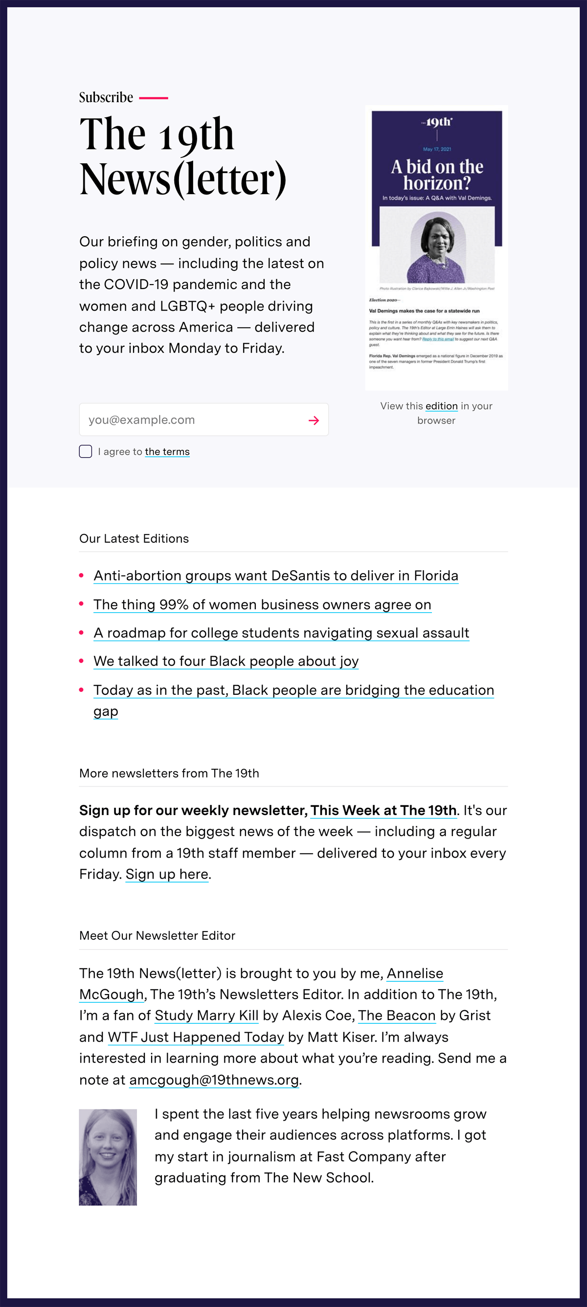
The 19th* News
Location: Austin, TX
Website: 19thnews.org
Call-to-action: Subscribe plus an arrow
Required fields: Email address
Comments:
A fantastic signup page. Let’s break it down.
- The description at the top focuses on what to expect: topics covering gender, politics, women, and LGBTQ+ people. It’s clear and confident.
- Simple signup form with a link to the terms.
- Link to five recent editions to show rather than tell how good the newsletter is.
- Link to the weekly newsletter, but not in a way that distracts from the primary signup.
- A brief introduction to the person writing the newsletter.
I appreciate how this newsletter signup page has a clear hierarchy from top to bottom. The most important piece for readers and The 19th* are at the top, and everything below the signup is designed to overcome potential objections.
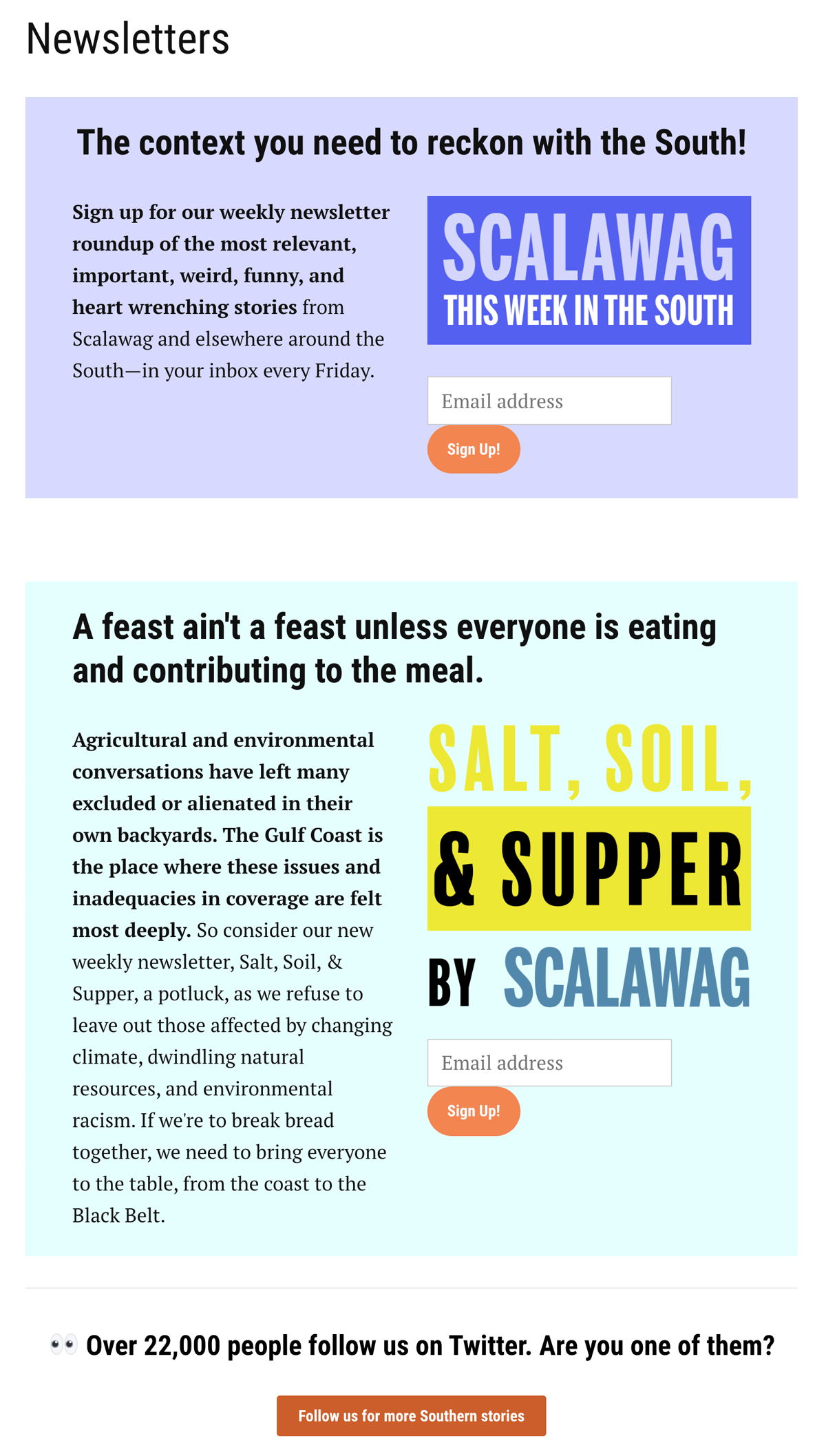
Scalawag
Location: Durham, NC
Website: scalawagmagazine.org
Call-to-action: Sign up!
Required fields: Email address
Comments:
What I like about this one is that there are two different newsletters, presented so they visually a person can see they are different before reading the descriptions.
At the bottom, Scalawag uses social proof — “Over 22,000 people follow us on Twitter” — to pitch their Twitter account softly. This is a great example of using your newsletter signup page to point readers to other channels without bombarding them with decisions.
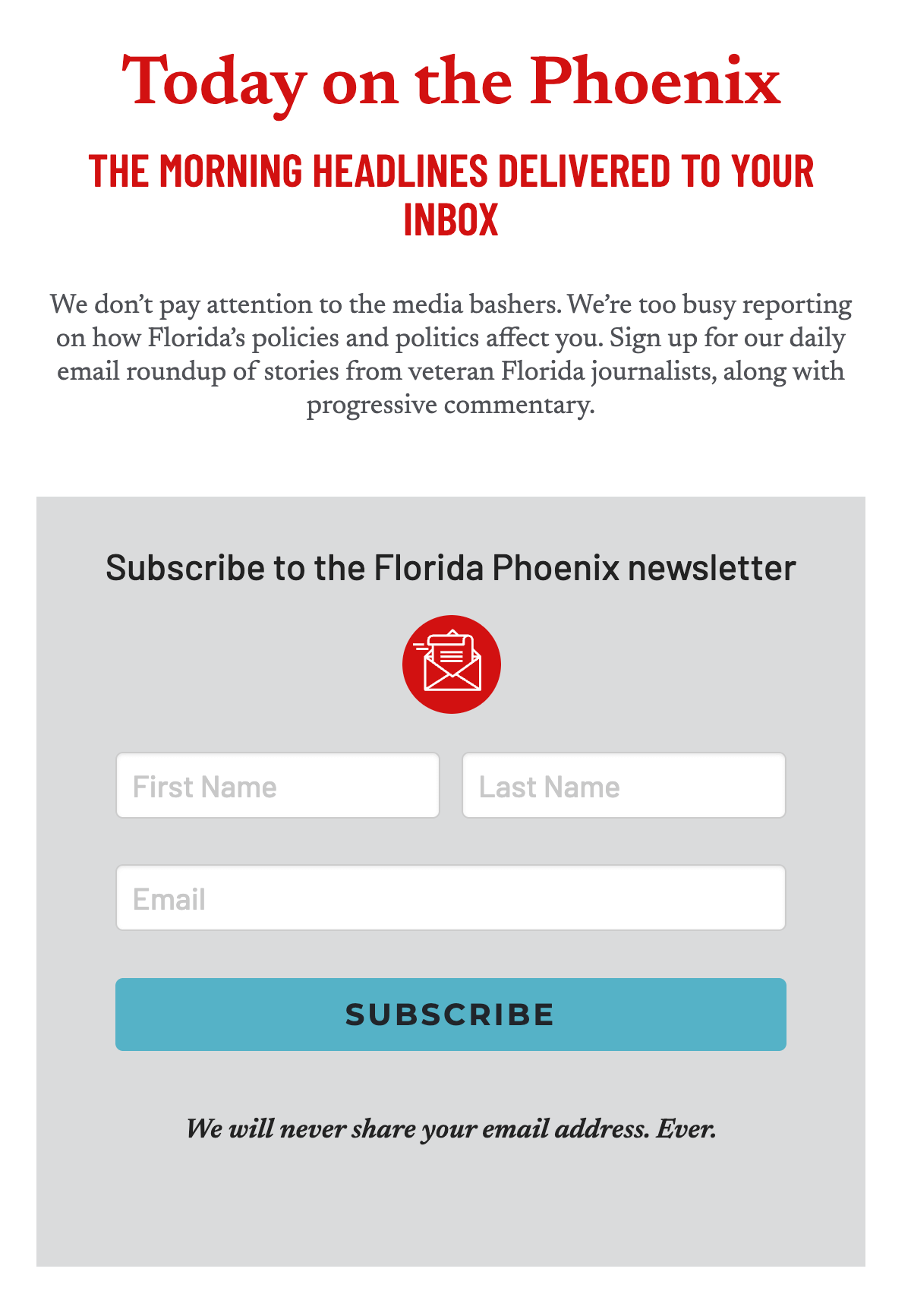
Florida Phoenix
Location: Tallahassee, FL
Website: floridaphoenix.com
Call-to-action: Subscribe
Required fields:
First Name
Last Name
Email address
Comments:
Simple and straightforward. Simple doesn’t have to be boring! The Phoenix sprinkles a little attitude with “We don’t pay attention to the media bashers” right at the top.
This form asks for first and last names. When asking for more information, it’s nice to get ahead of any objections by pointing out “We will never share your email address” as the Phoenix does here. Even better would be a link to the Privacy Policy.
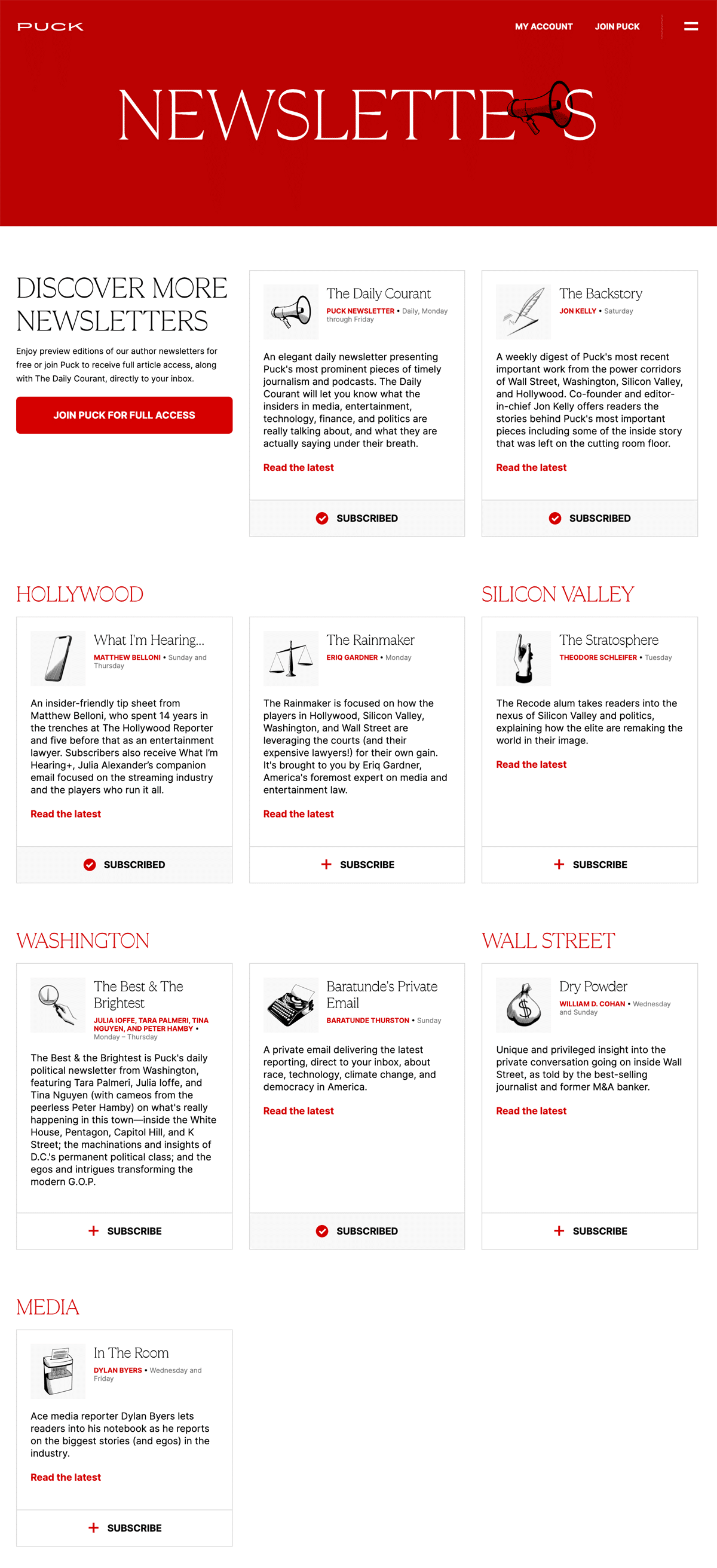
Puck News
Location: New York, NY
Website: puck.news
Call-to-action: Subscribe
Required fields:
First Name
Last Name
Email address
Comments:
Overall, this presentation is nice for a newsletter signup page with nine different options. There is good white space between elements, which takes the decision-making pressure off the reader.
On the other hand, I think the descriptions are too long for my taste. There are frequent mentions of insider stories about media, tech, finance, and politics, yet it’s not always clear how the newsletters are different aside from the author.
The images fit with the overall style of the site, which is better than generic stock images. They don’t really help understand what each newsletter is about though.
Finally, I love newsletters that share samples, but these samples are too short to be useful to new readers.
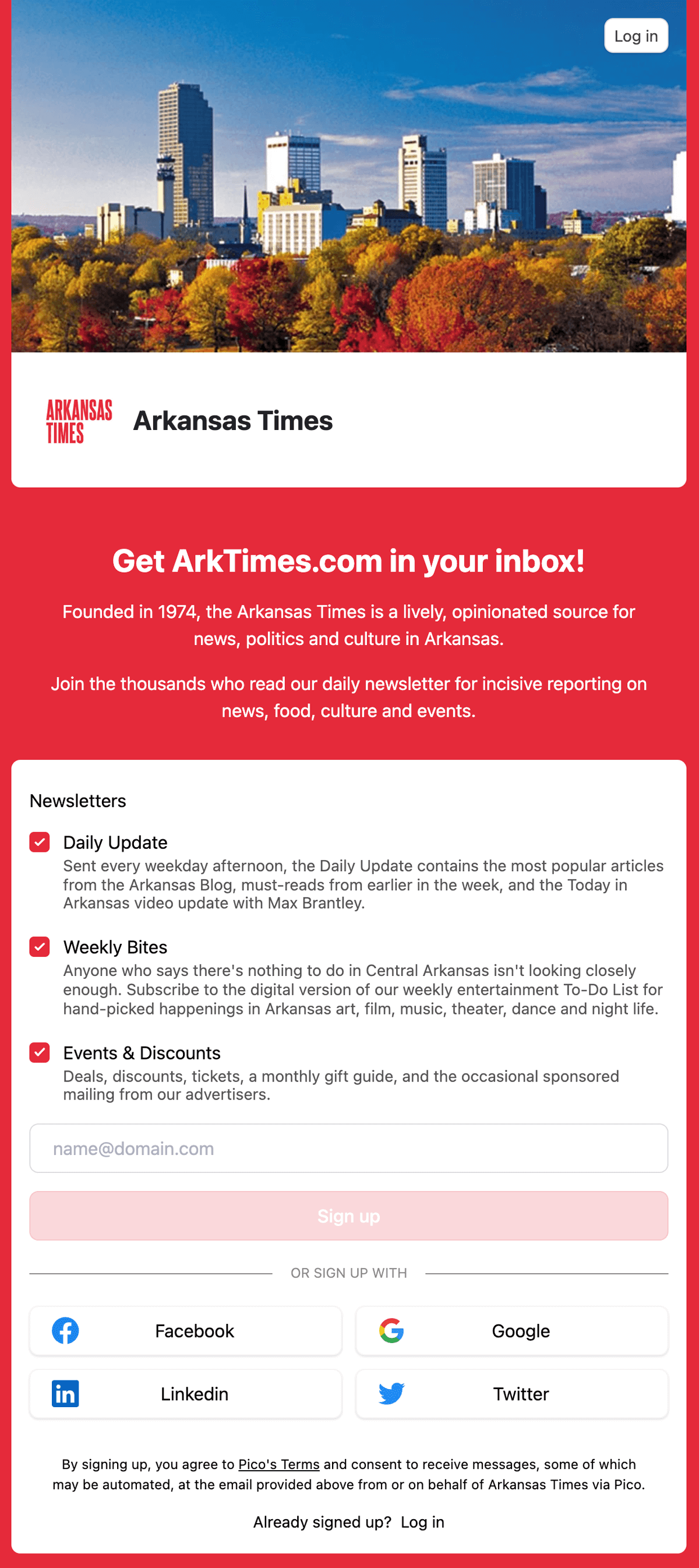
Arkansas Times
Location: Little Rock, AR
Website: arktimes.com
Newsletters: pico.link/arktimes/dm5kq2dm
Call-to-action: Sign up
Required fields:
Email address
Comments:
This is the standard Pico signup page. It’s easy to set up and update, and the trade-off is that customization is limited.
Two things I like about how the newsletters are described here:
- Have a little fun! Under the Weekly Bites newsletter, it says “Anyone who says there’s nothing to do in Central Arkansas isn’t looking closely enough.”
- Separate opt-in for events and discounts. A quick way to drive readers away from your newsletter is to swamp them in ads soon after signup.
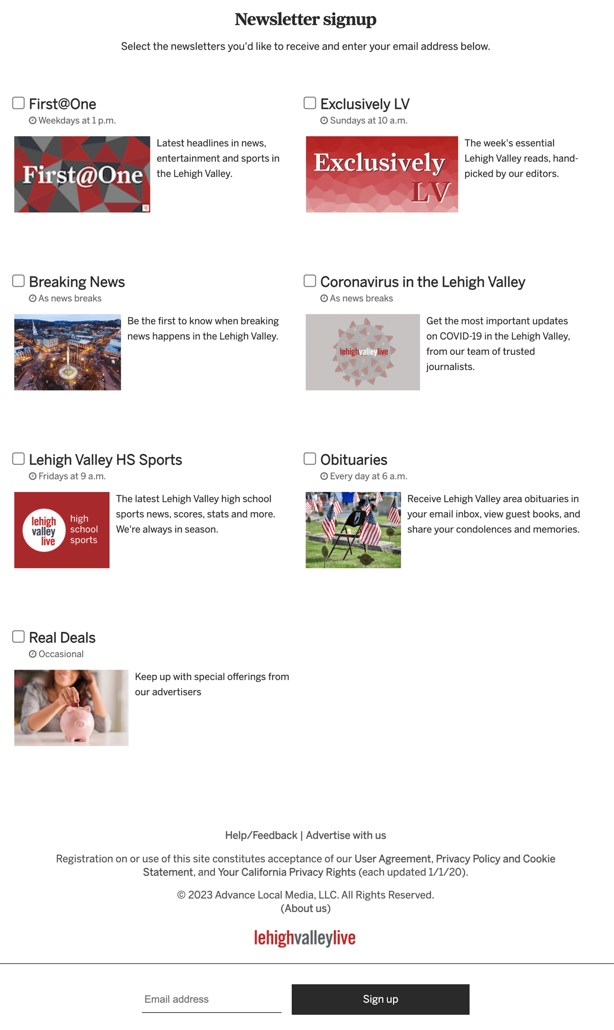
Lehigh Valley Live
Location: Easton, PA
Website: www.lehighvalleylive.com
Call-to-action: Sign up
Required fields:
Email address
Comments:
Not bad, but a few minor updates would be a noticeable improvement. This is the first landing page in this list to detail when readers will receive the newsletter, which is nice.
I’m not a fan of the bottom-drawer email signup forms. I think they are too easy to miss. However, if you are stuck with one, adding contrast or even animation helps.
Under the newsletters is a very clear Help/Feedback link. As easy as newsletter professionals think your signup is, the truth is many people run into issues. Make it easy to ask for help.
My hunch is the different-sized images are to show hierarchy, but it comes across as sloppy and disorganized. There are better ways to show hierarchy than this.
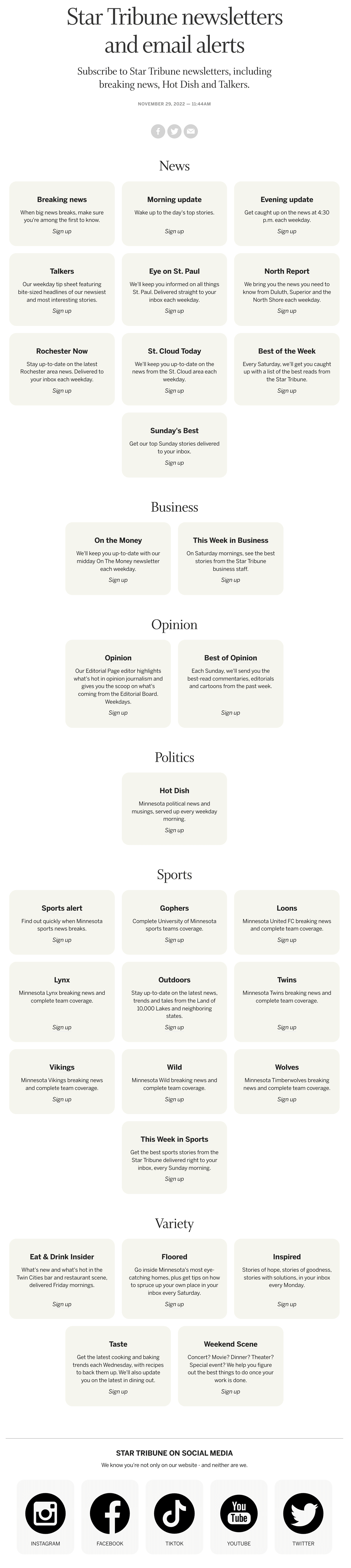
Minneapolis Star Tribune
Location: Minneapolis, MN
Website: www.startribune.com
Call-to-action: Sign up
Required fields:
Email address
Comments:
99 Newsletter Project readers know that boring is worse than bad. Sadly, this is boring.
- Are these newsletter options or the world’s most beige board game?
- The only contrast for the Sign up call to action is italics. This doesn’t stand out enough.
- None of these offer much other than “staying up-to-date.”
The subhead says “Subscribe to Star Tribune newsletters, including breaking news, Hot Dish and Talkers.” This is speaking to people who are already familiar with these newsletters, who are presumably already signed up.
I thought Hot Dish was about Minnesota food. It’s not. It’s about politics. I had no idea what “Talkers” might be about until I found it in the beige boxes.
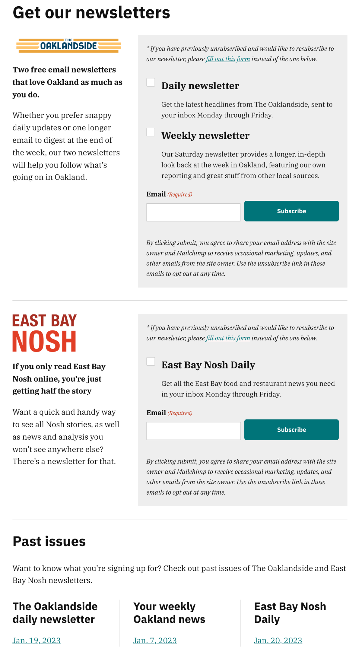
Oaklandside
Location: Oakland, CA
Website: oaklandside.org
Call-to-action: Subscribe
Required fields:
Email address
Comments:
A little busy, but everything is organized nicely to keep it from being overwhelming.
Oaklandside turns off the sidebar on this page, which is something their sibling publication Berkeleyside does not. With the sidebar included, Berkeleyside’s newsletter signup page has too much information that’s distracting from the form.
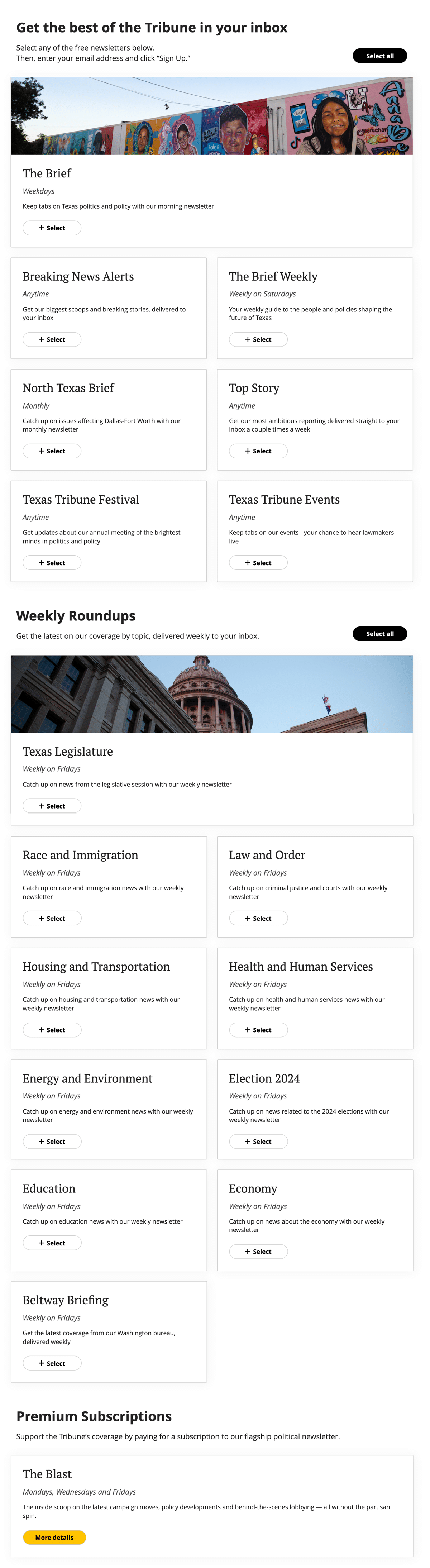
Texas Tribune
Location: Austin, TX
Website: www.texastribune.org
Call-to-action: Select, then Sign Up
Required fields:
Email address
Comments:
Lovely and simple. The Texas Tribune newsletter signup page is interesting because I feel like I notice updates several times a year. It’s not a static page that never tries anything new.
What I love here is how the page has 17 free newsletter options, but it doesn’t feel overwhelming. This is a good contrast to Lehigh Valley News and Minneapolis Star Tribune.
The Brief, the daily flagship newsletter is featured at the top with an image and a two-column box.
Midway down the page, there is a heading for Weekly Roundups and another two-column box with a featured image of the Texas capitol. This breaks up a wall of newsletters.
At the bottom, there’s a third heading for Premium Subscriptions. To show that this isn’t a free option, the call-to-action button is the Tribune’s gold color and links to “more details” rather than “Select”.
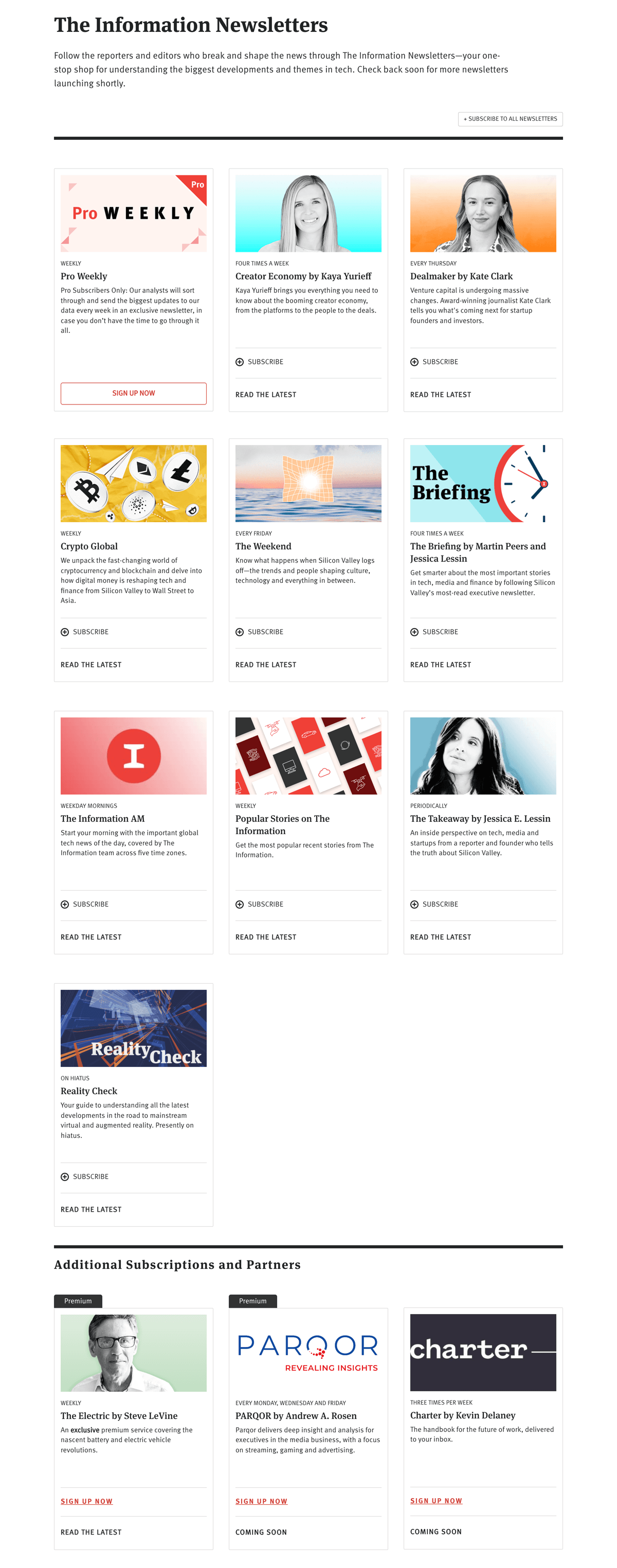
The Information
Location: San Francisco, CA
Website: www.theinformation.com
Call-to-action: Subscribe, then a customized CTA button on the pop-up form.
Required fields:
Email address
Comments:
This is a solid newsletter signup page. A strong border and a header separate free newsletters and premium newsletters, making it easier to notice the difference.
The Information does something I don’t see very often. When you click “Subscribe” on a newsletter card, you get a pop-up where you enter your email address. The call-to-action on that pop-up is customized to each newsletter! Rather than “Subscribe” it says “Subscribe to The Dealmaker.”
These descriptions are more effective than those at Puck News above. They are shorter and more clear about what you get.
The authors’ headshots are nice, but this also shows what happens when you have many newsletters and need images for each card. It quickly devolves into clichés: clocks, coffee mugs, and crime scene tape are everywhere. If the best you have is a cliché, it’s not going to be a persuasive image.
Charlottesville Tomorrow
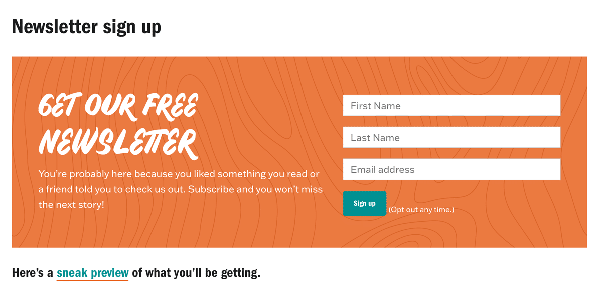
Location: Charlottesville, VA
Website: www.cvilletomorrow.org
Call-to-action: Sign up
Required fields:
First Name
Last Name
Email address
Comments:
I like a short and simple newsletter signup page.
“You’re probably here because you liked something you read,” is a fun hook to encourage people to signup. Also, I love the tease of “sneak preview” to give people a newsletter sample.
Montgomery Advertiser
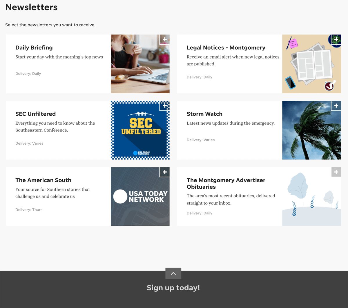
Location: Montgomery, AL
Website: www.montgomeryadvertiser.com
Call-to-action: Sign up today and Sign Up
Required fields:
Email address
Comments:
This is the standard Gannett newsletter signup page.
Cliché alert! We have two coffee mugs: one for Daily Briefing and an illustrated mug in the bottom right of Legal Notices.
Layout-wise, this is acceptable. Easy to read and brief with sending frequency provided. If you are a local publisher with Gannet in your market, it’s easy to show value better than this.
Kansas City Defender
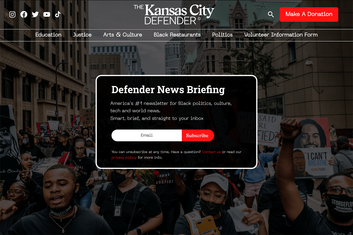
Location: Kansas City, MO
Website: kansascitydefender.com
Call-to-action: Subscribe
Required fields: Email address
Comments:
I love bold statements: “America’s #1 newsletter for Black politics, culture, tech and world news.” A few other things I love about this newsletter signup page:
- The background appears to be during the Black Lives Matter protests of 2020. This is a clear way to show who this newsletter and publication is for.
- A link to the Contact Us page if someone has questions.
- A link to the Privacy Policy.
Future Party
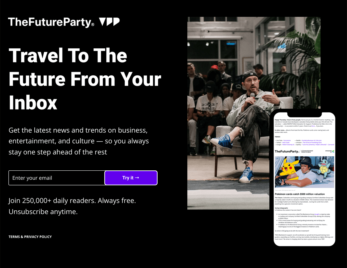
Location: Los Angeles, CA
Website: futureparty.com
Call-to-action: Subscribe
Required fields: Email address
Comments:
A simple signup page that leans into crafting a certain image.
- “Try it” is a nice spin on the standard subscribe or sign up.
- Rather than web version of the email, there’s a preview on a phone.
- Social proof: “Join 250,000+ daily readers.”
Documented
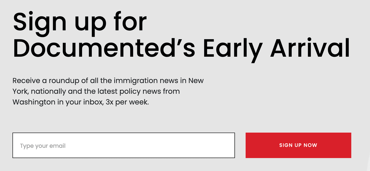
Location: New York, NY
Website: documentedny.com
Call-to-action: Sign up now
Required fields: Email address
Comments:
This a great example of focusing on one thing, saying what you need to say, and letting people sign up. If you have one newsletter and aren’t happy with your signups…steal this format. It’s strong.