
4 little newsletter design upgrades your readers will love
Designing emails is hard.
Email is an old format. It’s restricted from different directions by different inbox providers. There’s so much that doesn’t work in email the way it might on the web or in an app. Or it works in Gmail but doesn’t work in Outlook. Or vice versa. This leads email newsletter design to be pretty basic most of the time.
And if you aren’t a strong designer, it’s easy to look at something simple and mistake it for boring. So you start jazzing it up. It’s a common pitfall for newsletters. A little color here and a little sparkle there, and now it’s not boring, but it’s also no longer simple.
The beauty of simple design is that it’s easy for many people to use across different contexts. That’s way more valuable than making an email that sparkles.
In a previous career, I was a professional designer. Here are my 5 tips for upgrades well within the reach of non-designers that will make readers love your design.
1. Establish a clear hierarchy
Design is communication, not decoration. How you communicate is as important as what you are communicating.
Hierarchy gives a newsletter structure. It’s the skeleton. Without strong bones, it won’t matter how you choose to dress it up.
Journalists are well aware of the inverted pyramid. Look at your newsletter’s underlying visual structure the same way. Not just in order of appearance — the most important information at the top — but in visual weight as well.
Visual weight is size, prominence and how it relates to other elements in the newsletter. Big & bold is the easy choice here. Does your Top Story look like the most important story of the day? Or does it look like the story you happened to put at the top?
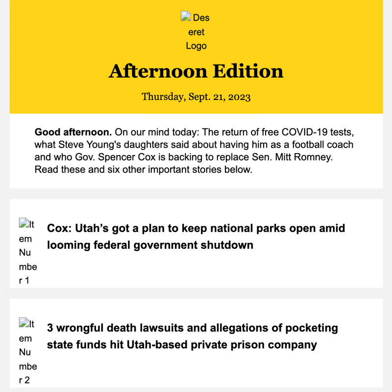
The Big Story from ProPublica
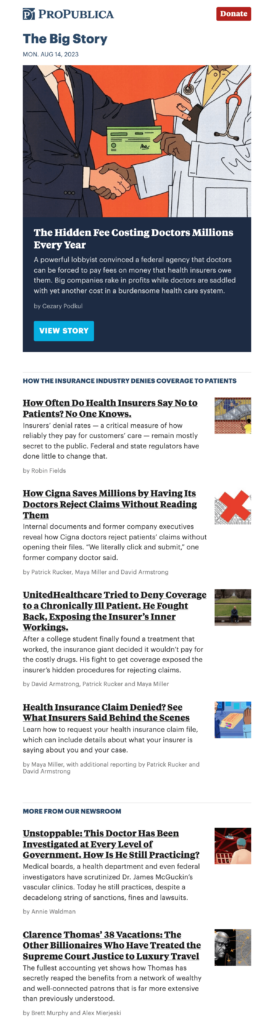
The Big Story newsletter features the big story of the day, prominently and featured at the top. The following two sections are in descending relevance: first, related health insurance stories, then links to other ProPublica stories.
Selves from Public Source
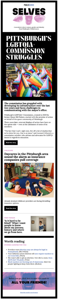
You can’t miss the top story in this edition of Selves from PublicSource in Pittsburgh. It’s big, and it’s bold. The secondary story is big but not as bold. As the reader moves down through the email, there’s a clear hierarchy that guides the reader and gives them context for each set of stories.
2. Extra space helps readers focus.
Many newsletters I see would benefit from a little extra space between stories and sections. Bigger elements often need a little more space to breathe. Otherwise, the newsletter gets jumbled together, which breaks down the hierarchy. Think about when you speak. If you talk like an auctioneer, it’s pretty damn hard to follow..
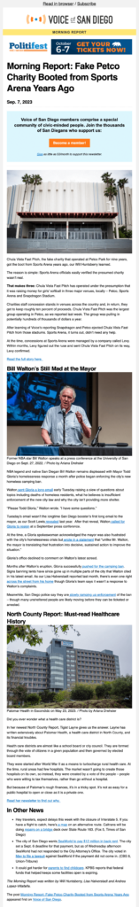
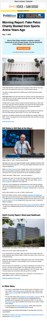
Morning Report from Voice of San Diego
Voice of San Diego has a good hierarchy in this newsletter, but I’d recommend adding extra space between the end of one story and the headline of the next. This adds some room for the elements to stand on their own and not be mistaken as a big block of stuff.
Original
With Space Added
3. Consistency makes your newsletter easier to read & understand
Think about how much the internet asks of you every day. Thousands of little inputs and hundreds of decisions all day long. Where’s the button to close the cookie banner? Aren’t I logged in — why am I getting the paywall? Is this an article or an advertisement?
People don’t have the energy to make all these decisions. It’s easier to check out or go somewhere else. As we introduce more elements to our newsletter, we ask people to make more decisions. What is this? What does it do? Is this important to what I’m trying to do? All these little decisions increase the reader’s cognitive load.
It gets worse. Researchers have studied how cognitive load decreases trust from readers. For journalists, this is the worst possible outcome.
Consistency tip: Make links obvious
The most common consistency issue I came across in this study is the mixing of link colors and text colors. If you use black or dark grey for headlines, then I recommend only using one single color for the rest of your links. And links only. Don’t use your link color or similar colors as section headings. It’s confusing.
Morning Edition from Chicago Sun-Times
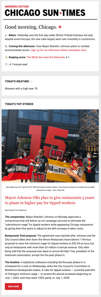
The Chicago Sun-Times is great at this. Everything red under “Good morning, Chicago.” is clickable. This includes text links, email links, and buttons. The button in the Bears promo may be orange, but it’s red enough that I’ll give it a pass.
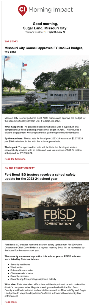
Morning Impact from Community Impact
For contrast, let’s look at this Morning Impact newsletter from Community Impact. This is what happens when you prioritize branding over the reader experience. The “Read the full story” links are in maroon, as are the section headings. The section headings aren’t links. Underlining links is great, but in this case it isn’t enough to differentiate entirely.
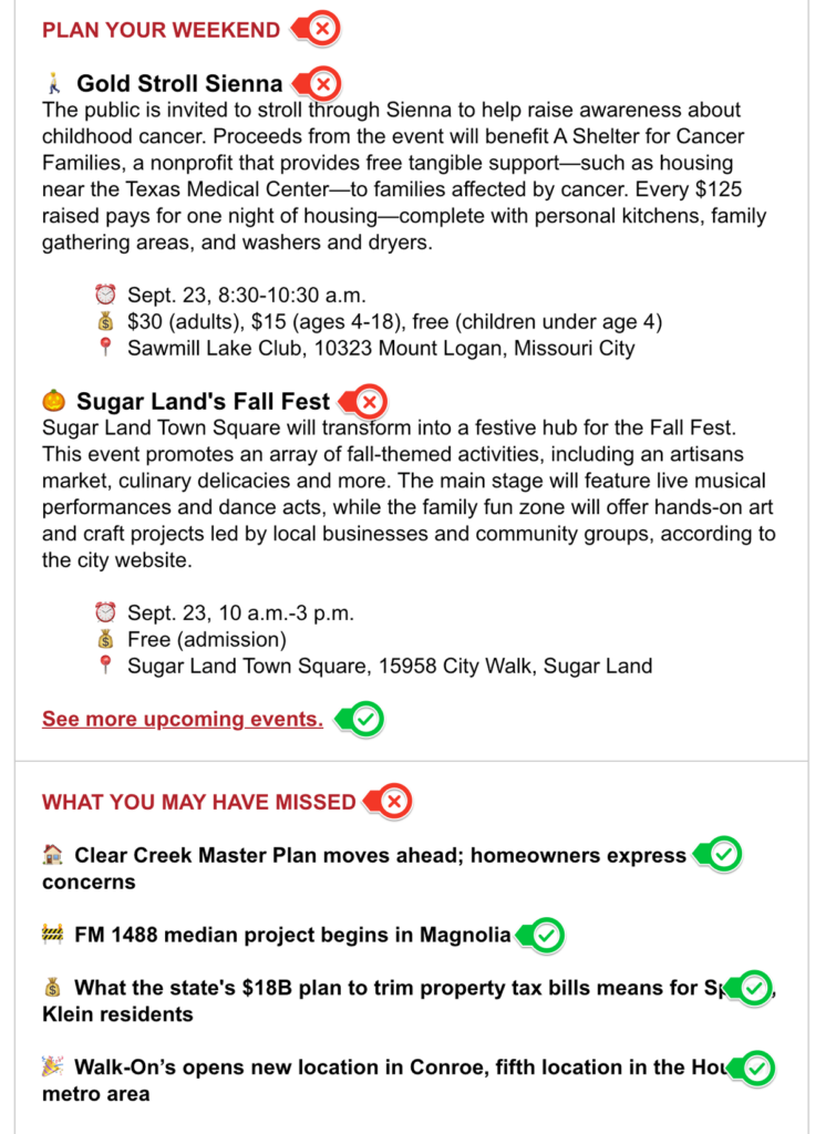
Links get even more confusing in the “What you may have missed” section. The links are black and not underlined. This is the only part of this email with links in black text — even the headlines aren’t linked.
In this image, links are marked with a check, and text that isn’t linked is marked with an X. Note that color and font weight are sometimes linked, sometimes not.
Daily Newsletter from Atlas Obscura
Atlas Obscura does something a little different, and it’s great. The headlines and “Read more” links are bold and black. But they also link the category that’s in the light brown text with the headline.
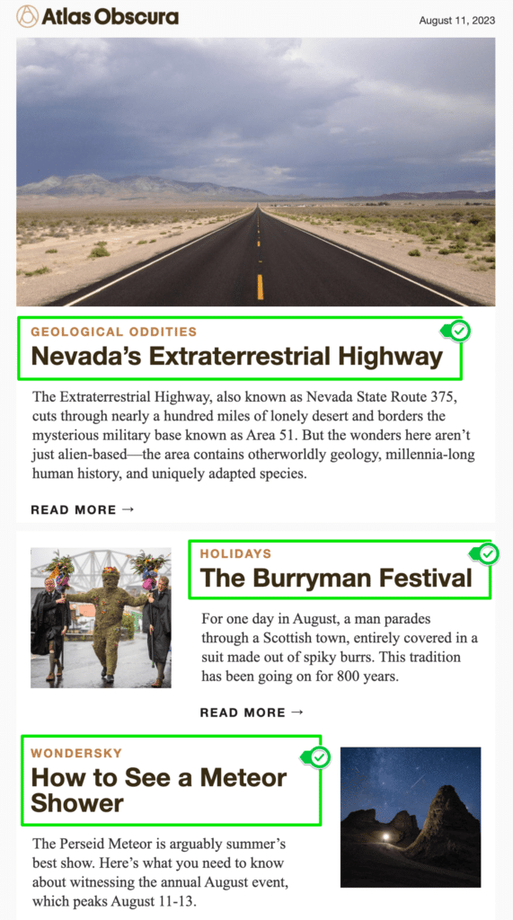
On a mobile device, it makes the clickable area larger. This makes it easier for the reader to hit what they want to click.
Unfortunately, this pattern isn’t carried down to the “Places to Explore” Section.
The flip side of making links obvious is that you should avoid making non-links look like they might be links. Keep in mind what type of patterns people are familiar with. For decades now, links have been blue. If you use unlinked blue text, make sure it’s crystal clear that it’s not a link through other contextual clues. Otherwise, people will assume it’s clickable. If nothing happens, it may appear broken, which will make them think twice before clicking again.
4. Don’t center text longer than 2-3 words
Center-aligned text is harder to read than left-aligned text. Imagine trying to read a book where the lines aren’t anchored along the left-hand side of the page. It would give you a headache in a hurry!
Centering section headings that stay the same in each newsletter is fine. But if you are changing the text regularly, it’s only a matter of time until you get that weird line break hanging one word by itself.
Alignment gives readers a guide to follow as they read or scan your newsletter. When in doubt, left-align that text and move on. It will look better on the left than floating in the middle with ragged edges.
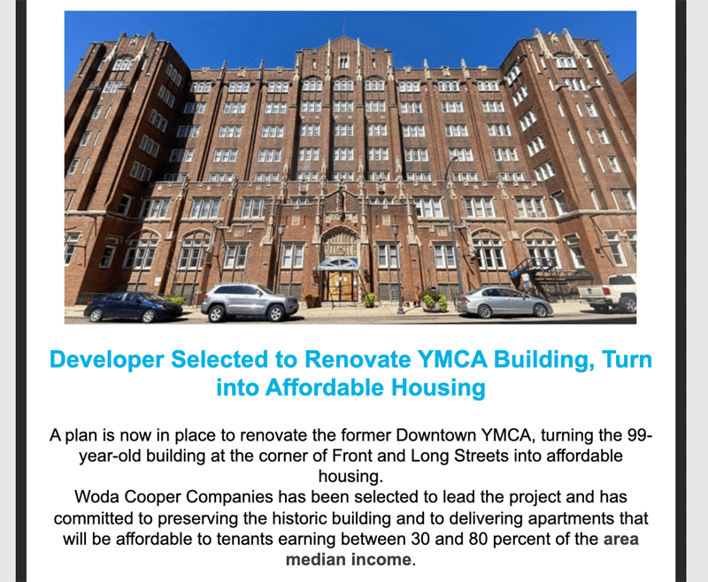
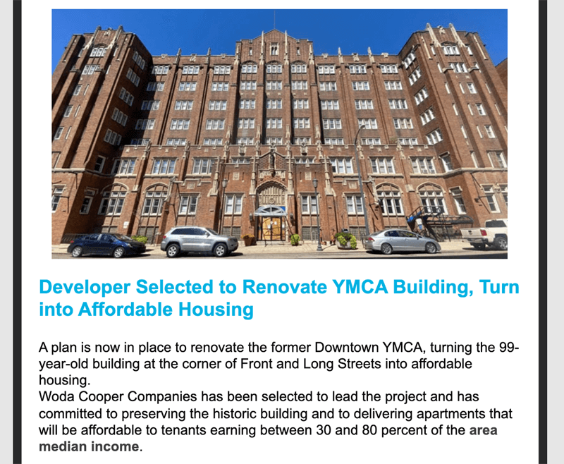
The Urbanist from Columbus Underground
Columbus Underground does a good job of creating structure and consistency. Left-aligning the text in these sections would improve this section and make it easier to read. Here’s what it looks like in a recent newsletter vs. a mockup of left-aligned text.
Original, Centered
Left-Aligned
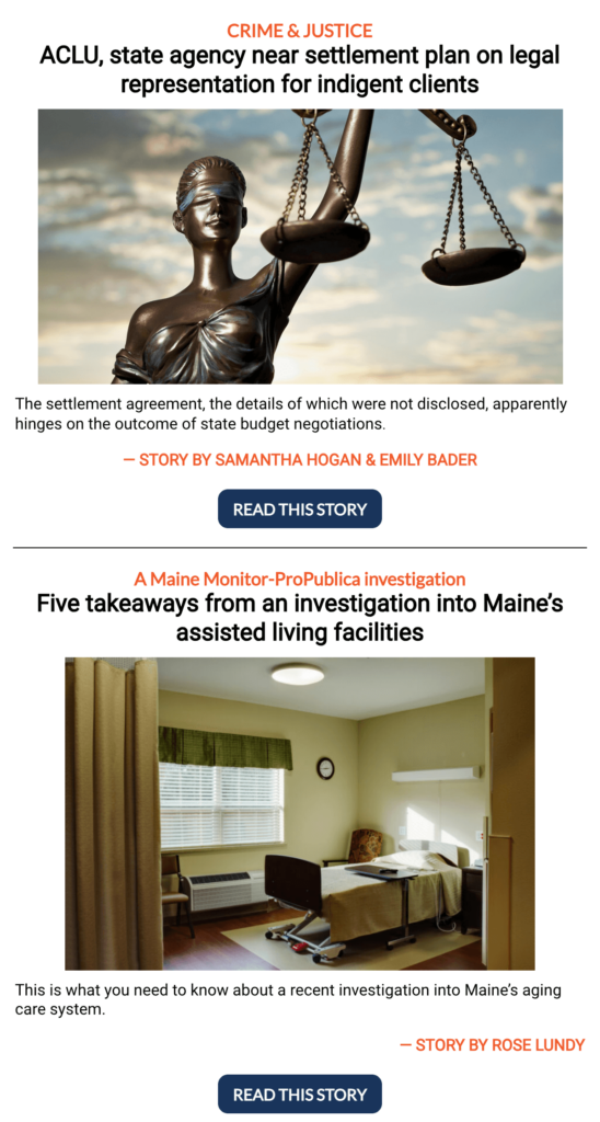
The Sunday Monitor from Maine Monitor
Maine Monitor uses inconsistent alignment throughout this newsletter, which makes it tough to read and impossible to scan. Here’s one section, plus a mockup that I pulled together to show better alignment and a little extra space.
Original, Centered
Left-Aligned
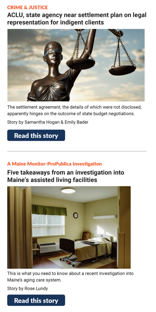
One extra thing I found odd is that Maine Monitor uses a navy and orange color scheme. On the site, it uses orange links, but switches to navy links in the newsletter. Orange and white is hard to work with because it can lead to contrast problems (more on that below). However, I’m not a fan of using the opposite colors for links on the site and in the newsletter.
Two bonus tips that shouldn’t be overlooked
Accessibility benefits everyone! Designing with accessbility included from the beginning is a requirement for good design.
- Check your color contrast, especially on grey backgrounds. I see a lot of text that fails contrast tests out there.
- Use alt text to describe images. Blaming the CMS isn’t a good reason to leave it out. This is not the best you can do:


 19")
